
910 App
910 App
Crafting a Seamless Experience to Encourage Users to Sync Strava
Crafting a Seamless Experience to Encourage Users to Sync Strava
Role
Role
UI/UX Designer
UI/UX Designer
About 910
About 910
910 (Nineten), one of Indonesia’s leading running‑shoe brands under the Wijaya Arta Mandiri Group, where it is one of the largest manufacturers of international shoes.
910 (Nineten), one of Indonesia’s leading running‑shoe brands under the Wijaya Arta Mandiri Group, where it is one of the largest manufacturers of international shoes.
Executive Summary
Executive Summary
Crafting a seamless onboarding experience led to a significant increase in users syncing their Strava accounts to join challenges. This became a strong foundation for the app’s first launch.
Key Outcomes (Nov'25):
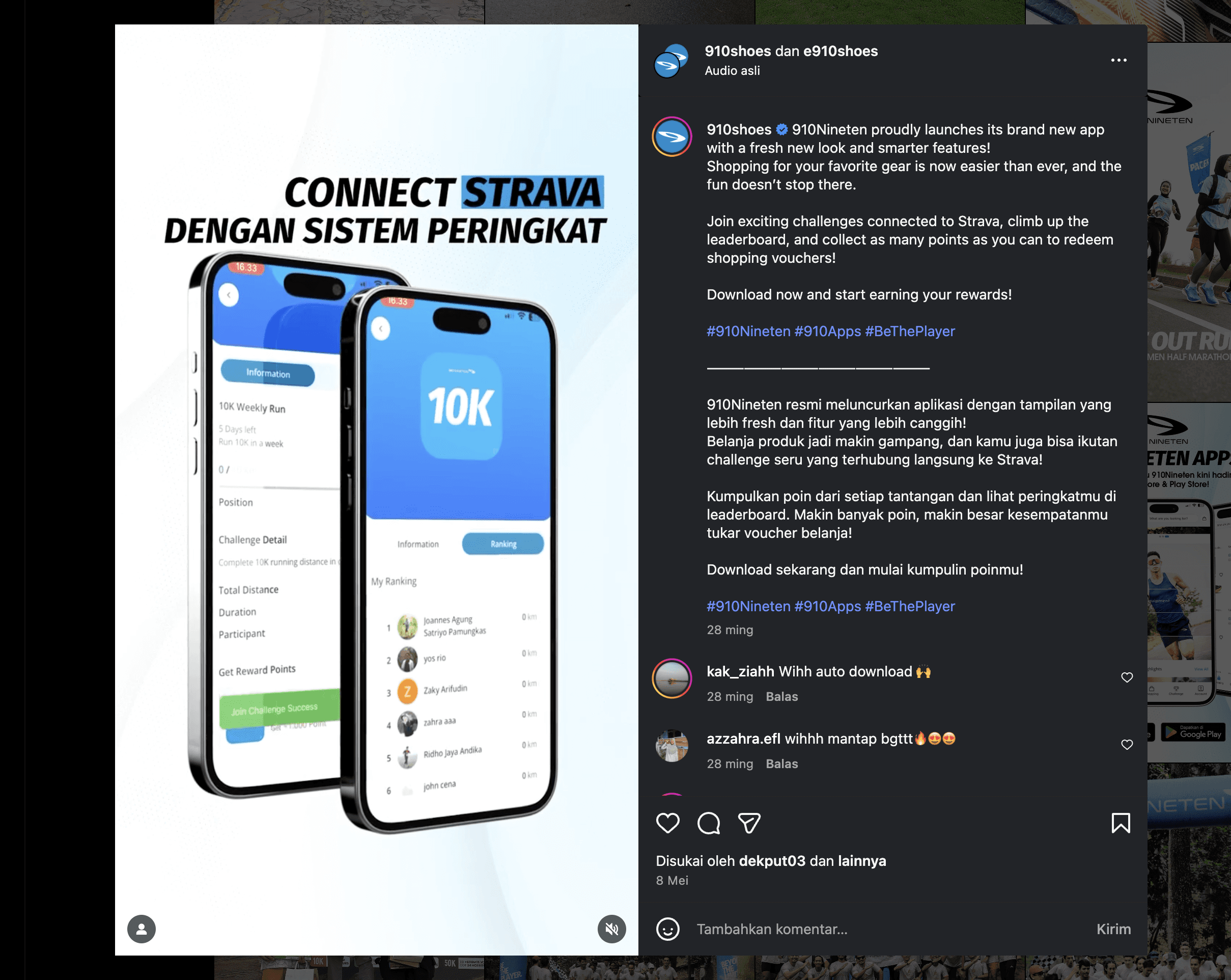
From 3,051 total downloads, 1,384 users synced their Strava accounts — a 45% sync rate. (The Result)
Out of those 1,384 synced users, 320+ joined the challenges, resulting in a 23% conversion rate.
Crafting a seamless onboarding experience led to a significant increase in users syncing their Strava accounts to join challenges. This became a strong foundation for the app’s first launch.
Key Outcomes (Nov'25):
From 3,051 total downloads, 1,384 users synced their Strava accounts — a 45% sync rate. (The Result)
Out of those 1,384 synced users, 320+ joined the challenges, resulting in a 23% conversion rate.
3.05K+
Users download (Playstore)
Users download (Playstore)
1.3K+
Syncs Strava in 910App
Syncs Strava in 910App
320+
Join challenges
Join challenges
4.3
Rating in Playstore
Rating in Playstore
Latest Data on November 2025, If you want to detail: Contact Me
Background Story
Background Story
Back to 2024, 910 have ambition to build their mobile commerce app. Collaboration with ICUBE. I was part of an project with my Senior UI/UX Designer, Raditya Pamungkas.
Since the beginning of this project, one of the long-term goals has been to introduce a synchronization feature with Strava.
The idea is to allow local runners to connect their Strava accounts (a running-tracking app) directly to the 910 app so they can participate in various challenges.
These challenges will later generate running results that are accumulated and displayed on a leaderboard, allowing runners to compare their performance with others.
Main Goals
Main Goals
Convincing users (especially local runners) to enable notifications and accept challenges from 910 through Strava synchronization and becomes a key part of the experience of feature's client.
Convincing users (especially local runners) to enable notifications and accept challenges from 910 through Strava synchronization and becomes a key part of the experience of feature's client.
Started Mini Research Study: Nike
Started Mini Research Study: Nike
I was provided Nike as a benchmark reference. With that direction in mind, I began conducting a mini research study.
I was provided Nike as a benchmark reference. With that direction in mind, I began conducting a mini research study.
Due the timeline was tight, i only have 1–3 days before delivering the first output to the client, the research focused only on a few key aspects.
Due the timeline was tight, i only have 1–3 days before delivering the first output to the client, the research focused only on a few key aspects.
Despite the limited time, these insights became the foundation for shaping the next design decisions.
Despite the limited time, these insights became the foundation for shaping the next design decisions.


Findings Mini Research
Findings Mini Research
I've do mini research and found three key aspects emerged:
1. Content
The content is personalized through a series of questions.
The copy feels warm, welcoming, and personal, helping users ease into the experience.
2. Experience
Users are given full control over their shopping preferences.
A progress bar helps them understand how far they are in the onboarding flow.
After completing onboarding, users are still guided toward the search page to begin exploring products.
3. Interaction
Smooth animations help transition users seamlessly from one screen to the next.
In summary, Nike’s onboarding empowers users to shape their own preferences, ultimately creating a more personalized shopping experience.
Another Findings …
Another Findings …
From the aspects mentioned earlier, Nike’s onboarding still has several shortcomings, such as:
A very long onboarding process that takes time to complete (six screens, not including language screen).
Obvious product selling (which is good, as it supports the company’s business model).
A progress bar that lacks clarity, making it difficult for users to understand which stage they’re currently in.
These issues show that even well-known brands can struggle to balance business goals, user expectations, and clarity within the onboarding experience.

Something Missing but Highly Important
Something Missing but Highly Important
From these earlier aspects, Nike’s onboarding shows an interesting approach: users are given full control, but only within the boundaries of personalization.
In reality, the best onboarding is often… no onboarding at all.
For me, users shouldn’t feel like they need an onboarding flow to start using the product.
When the experience is intuitive enough, the product guides them naturally, without ever having to introduce itself.
And then, We don't need onboarding, right?
And then, We don't need onboarding, right?
I think we still need onboading; instead, it gives users the option to have full control and freedom without being forced into an onboarding flow.
The goal is to allow users or customers to freely explore the app, discover its features, and naturally be “guided” toward sign in in or sign up.
I think we still need onboading; instead, it gives users the option to have full control and freedom without being forced into an onboarding flow.
The goal is to allow users or customers to freely explore the app, discover its features, and naturally be “guided” toward sign in in or sign up.
Redefine Solution: Insight of Nike's Onboading
Redefine Solution: Insight of Nike's Onboading
From the insights above, I was able to narrow down several key directions:
Shorten the user journey to fewer than six screens.
Avoid being obvious, but keep clear and purposeful.
Provide transparency by providing visible progress indicators.
Create smooth interactions and animations to guide users naturally from one screen to the next.
Guest Option, giving users the freedom to explore the app without onboarding.
Provide empty state in every edge case while user exploring apps
These points became the foundation for refining the onboarding experience for making it simpler, clearer in 910's onboarding
Solution: Shorten Journey
Solution: Shorten Journey
Less is more. Less effort is equal to more reward.
From the splash screen to the final onboarding step, the entire journey 3 stages: Impression, Adoption, and Retention.
Impression: Stage for 910app give best impression with gen Z tone of voice.
Adoption: Accomplishing intended goals to achieve benefits: sync Strava
Retention: Continuous to use and explore 910app after syncs the Strava
Since we're not focus on selling product and related bussiness model. We focus on how user active their strava in our 910app in onboading

Solution: Don't Being Obvious, but Clear and Purposeful
Solution: Don't Being Obvious, but Clear and Purposeful
When crafting the copy for the onboarding content, I applied the principle of being clear and purposeful without being overly obvious.
The difference between the first design and the final version is striking, especially in how the wording evolved.
The later version feels more welcoming and empathetic while still delivering the necessary information. It avoids being too straightforward (obvious), yet remains intuitive for users to understand.

Since we're not focus on selling product and related bussiness model. We only focus on how user could sync their strava in our 910app in onboading.
Since we're not focus on selling product and related bussiness model. We only focus on how user could sync their strava in our 910app in onboading.
Solution: Provide Transparency
Solution: Provide Transparency
The progress indicator component was intentionally designed differently from Nike’s, as the goal of this onboarding is not personalization, it's feature adoption.
It's purpose is to give users a clear sense of where they are in the journey, helping them understand their current stage and what comes next.
By providing progress indicator component, the onboarding flow feels more structured and reduces uncertainty as users move through each step.
The different is real (see image below)

Solution: Smooth Interaction
Solution: Smooth Interaction
The transitions between screens were designed to be smooth, without excessive animations or micro-interactions.
This ensures that users, especially those with lower-end smartphones can load each screen easily.
It also helps our engineers deliver the app on time without being burdened by overly complex motion requirements 910app.

Solution: Guest Option
Solution: Guest Option
Often best onboarding is no onboarding. Guest option is the fastest way to explain the basic functionality our product in 910app.
With guest option, user could explore more apps and made user demand to use our features (challenges with sync to Strava).
In 910app, guest option is best way to add value and help avoided or if unavoidable required to sign in and sign up.

Solution: Provide Empty State
Solution: Provide Empty State
Provide the empty state after user or customers explore the product as guest give opportunity for users and ensure will lead to adoption.
Provide the empty state after user or customers explore the product as guest give opportunity for users and ensure will lead to adoption.

We provide in menu challenge in case already sign in and not sign in yet in 910app.
We provide in menu challenge in case already sign in and not sign in yet in 910app.

Design by Raditya Pamungkas
Design by Raditya Pamungkas
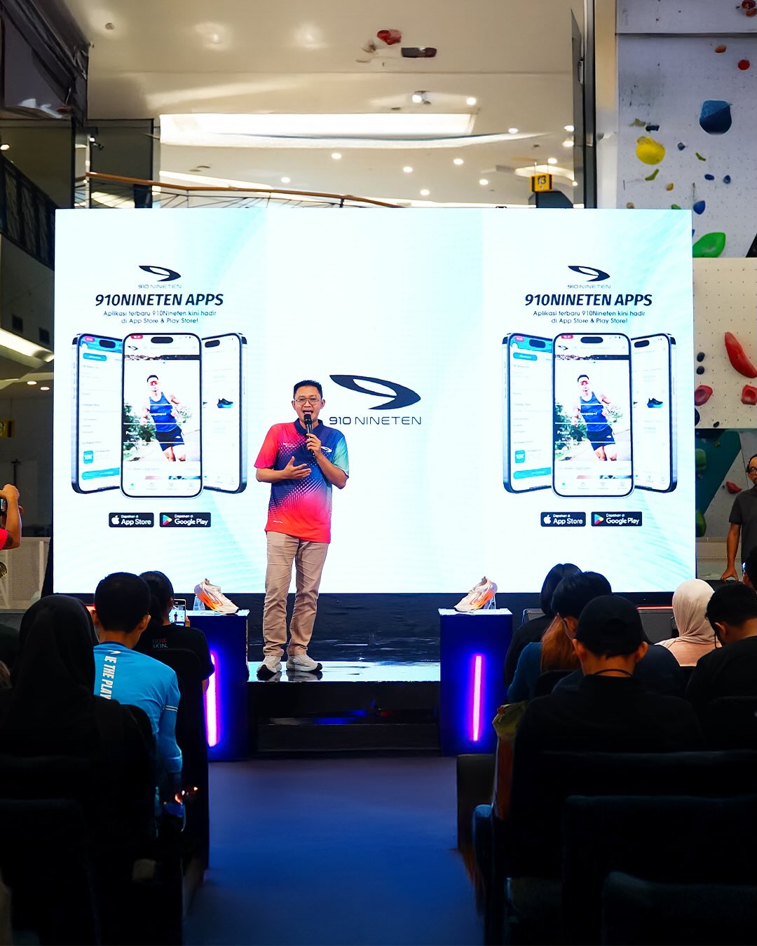
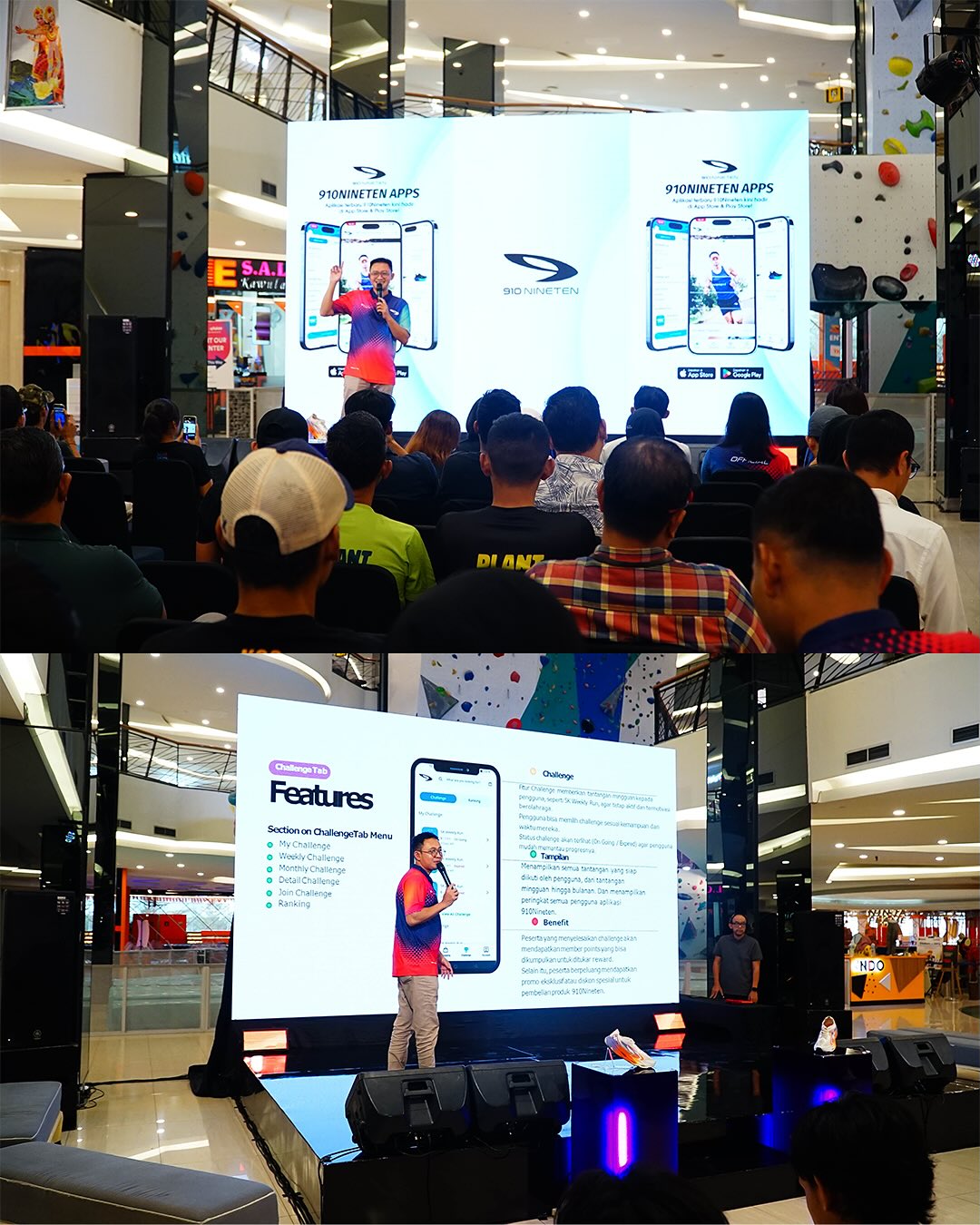
The Launch
The Launch
After long process of design process (I've design another works) in this development. The 910app has launched in Playstore May'25 globally in PLaystore and Appstore.
After long process of design process (I've design another works) in this development. The 910app has launched in Playstore May'25 globally in PLaystore and Appstore.
What I've Learn
What I've Learn
From observing the 910app since its launch until now (Nov ’25), I’ve learned several key things:
The importance of maintaining constant communication across the team, especially with Engineering to ensure that every decision is aligned and technically grounded.
The value of opening up space for feedback and transparently communicating the rationale behind design decisions to clients, so they understand not just what we design, but why design.
While clients hold full authority in decision-making, we should look the UX perspective, because it ultimately shapes how real users experience the product.
On the other hand, I also identified several opportunities for improvement after the project was launched:
Need testing to user and gather feedback, but since the goals is created features for client, I don't do that.
Need deep works for sync strava to join challenges.
Developing a more personalized onboarding experience, but depends on client.