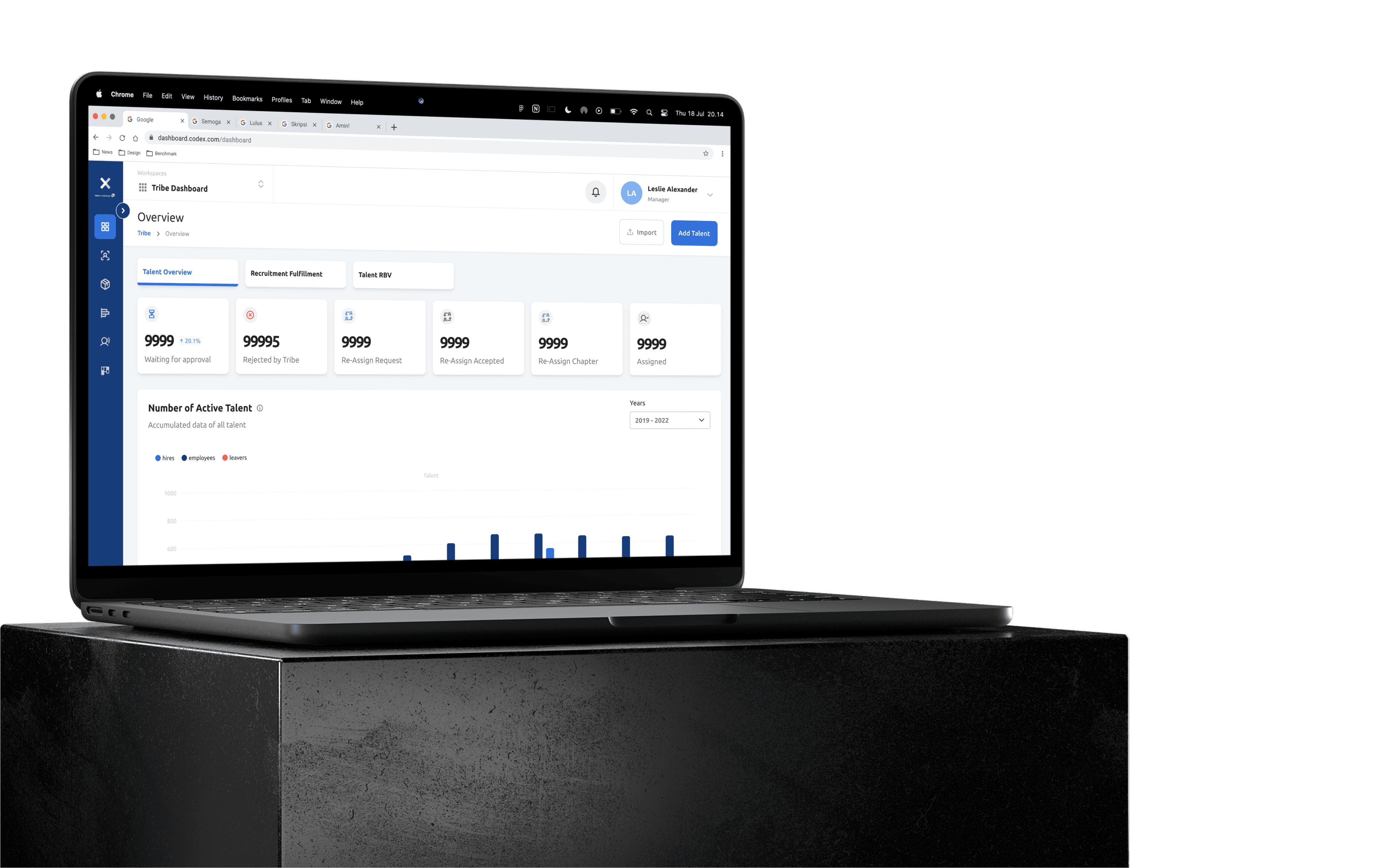
Codex Telkom
Codex Telkom
Make It Clear For Pie Chart Assignment Information
Make It Clear For Pie Chart Assignment Information
Role
Role
UI/UX Designer
UI/UX Designer
About Codex
About Codex
Codex powered by Telkom Indonesia, is a tool that assists Telkom's Human Resources or Human Capital in making decisions and managing 10.000+ Telkom's digital talent.
Disclaimer: The numbers is not real and i have permission to publish this works
Codex powered by Telkom Indonesia, is a tool that assists Telkom's Human Resources or Human Capital in making decisions and managing 10.000+ Telkom's digital talent.
Disclaimer: The numbers is not real and i have permission to publish this works
Executive Summary
Executive Summary
Successfuly deliver solution idea with design for increase readbility, clarity, and
I have been involved in creating design dashboard during in this works and successfuly deliver request from stakeholder so far.
Successfuly deliver solution idea with design for increase readbility, clarity, and
I have been involved in creating design dashboard during in this works and successfuly deliver request from stakeholder so far.
Background Story
Background Story
Codex Telkom (HR Platform), as part of Telkom Indonesia, is responsible for presenting accurate digital talent data for stakeholders.
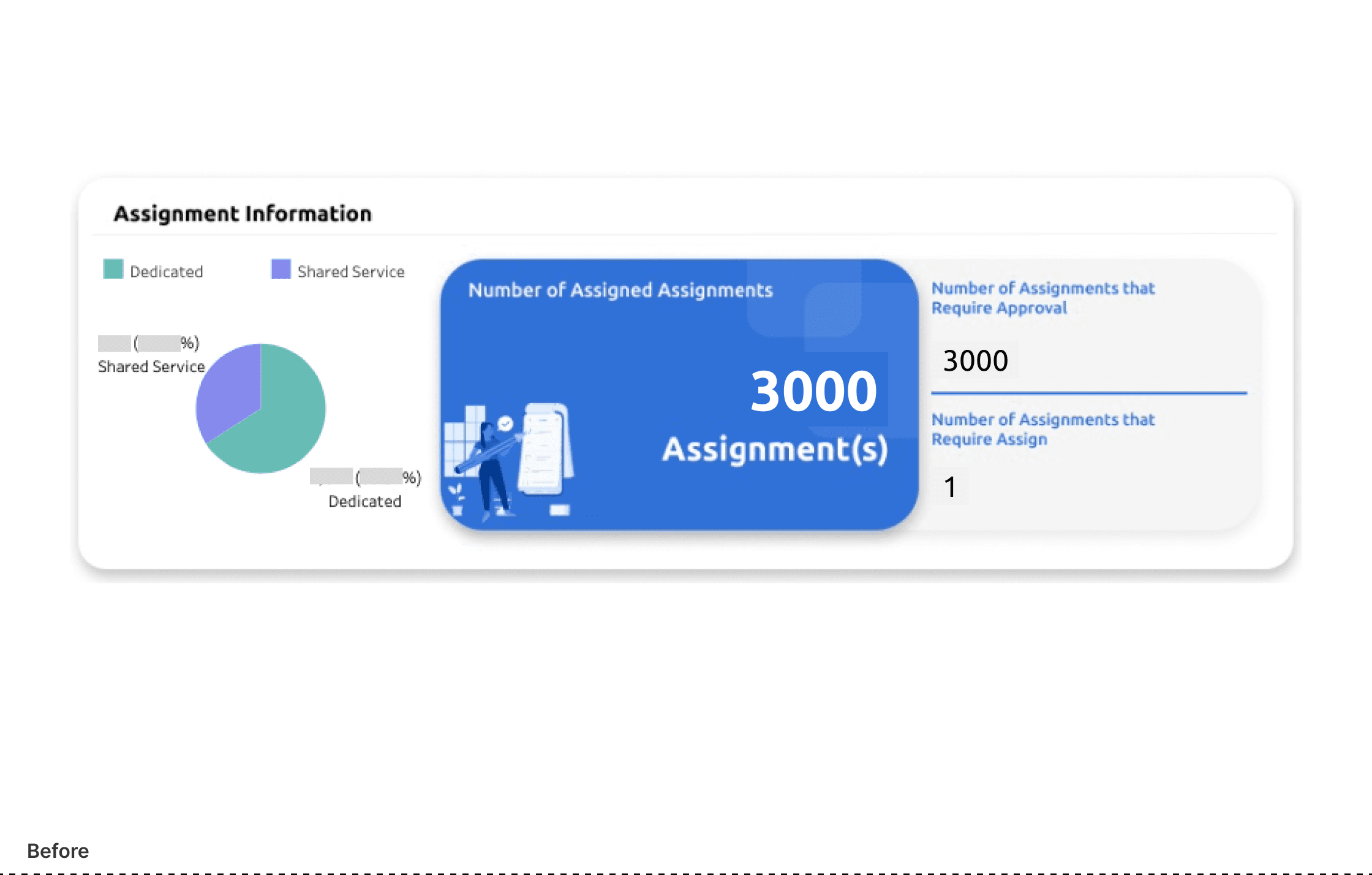
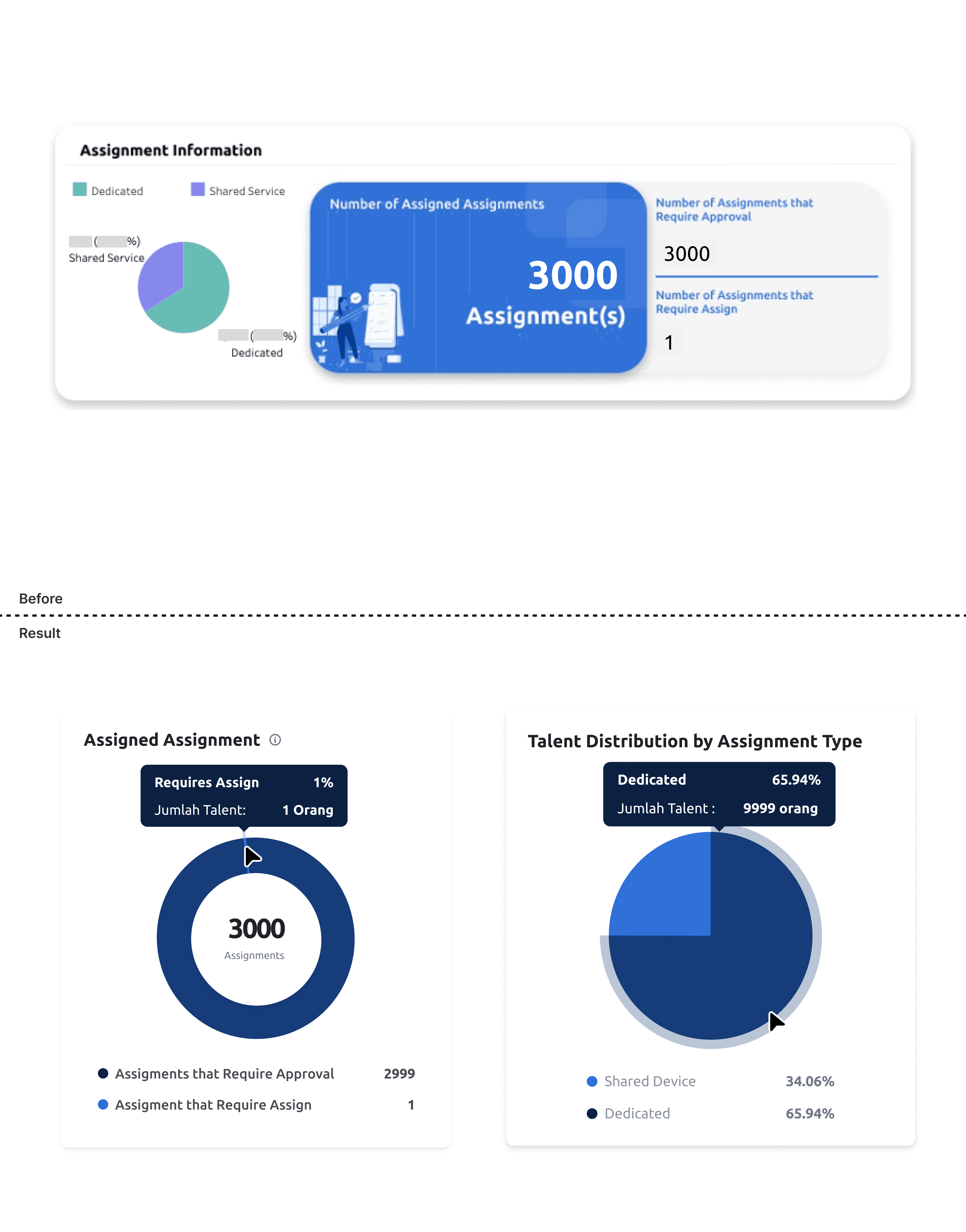
Our Assignment Information pie chart was struggling to convey its message effectively. Users found the text too small, the color contrast insufficient, and the information overly complex. It was time for a change.
Framework: How to do it?
Framework: How to do it?
Before diving in, let me share a bit about how we operate here at Codex Telkom. We have a UX Lean framework for tackling problems, but i modified for meticulously crafted to suit my specific needs. Given that our scope is focused on internal applications (From Codex Telkom, for Telkom :D)
Before diving in, let me share a bit about how we operate here at Codex Telkom. We have a UX Lean framework for tackling problems, but i modified for meticulously crafted to suit my specific needs. Given that our scope is focused on internal applications (From Codex Telkom, for Telkom :D)
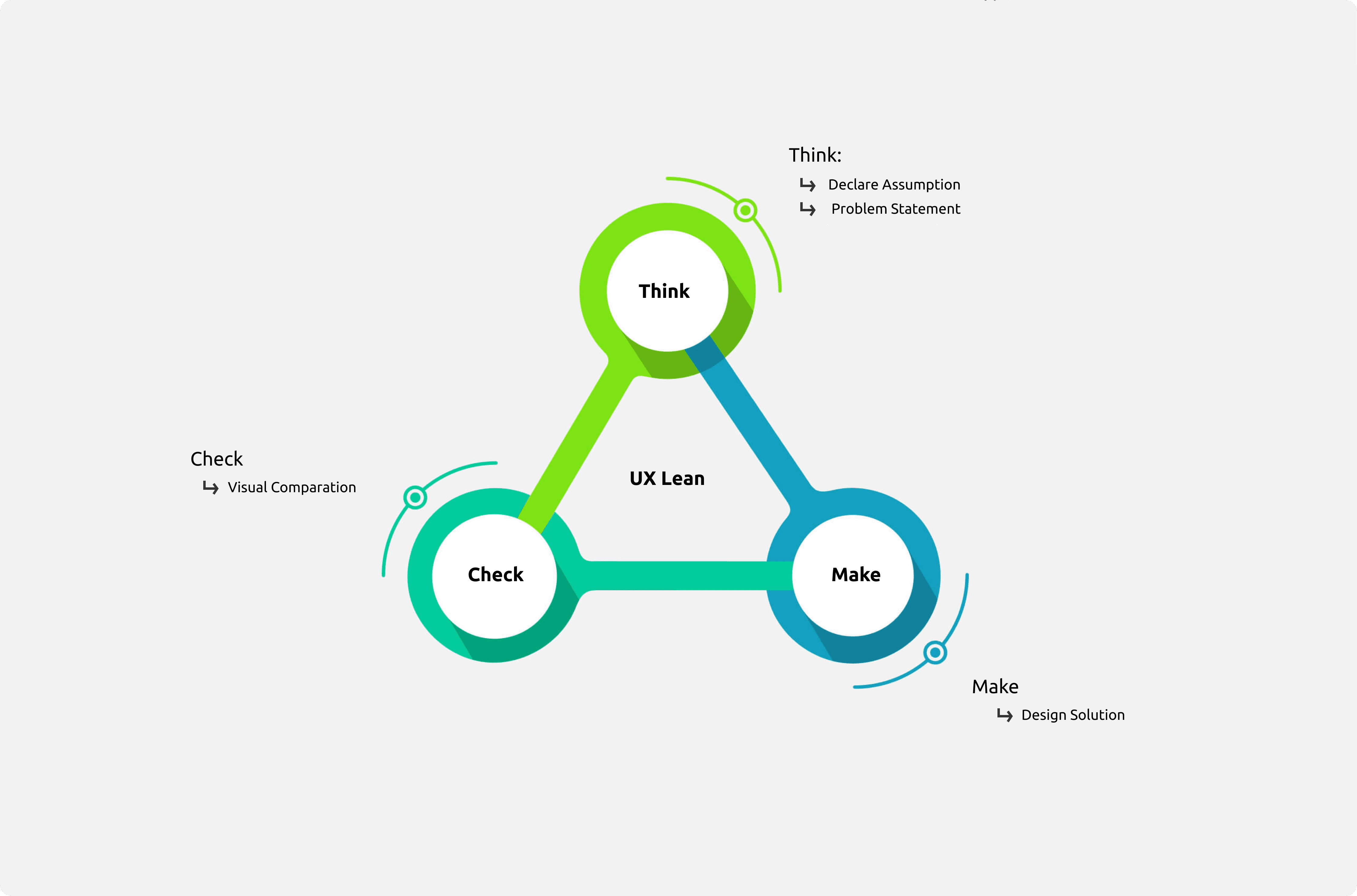


Declare Assumption
Declare Assumption
My assumed hypothesis is that the text is too small, and the color contrast is insufficient, but i try to validate to realted stakholder by my Lead Design.
My assumed hypothesis is that the text is too small, and the color contrast is insufficient, but i try to validate to realted stakholder by my Lead Design.


Problem Statement
Problem Statement
After several observations, discussions with the Lead Designer and researchers, and consultations with related stakeholders, i formulated the following problem statement:
Complex Information: Users have to shift through too far and much data to find what they need.
Poor Color Contrast: The pie chart’s colors blended too much, making distinctions hard.
Small Text: Users squinted to read the small text.
#1 Problem Statement: Complex Information
#1 Problem Statement: Complex Information
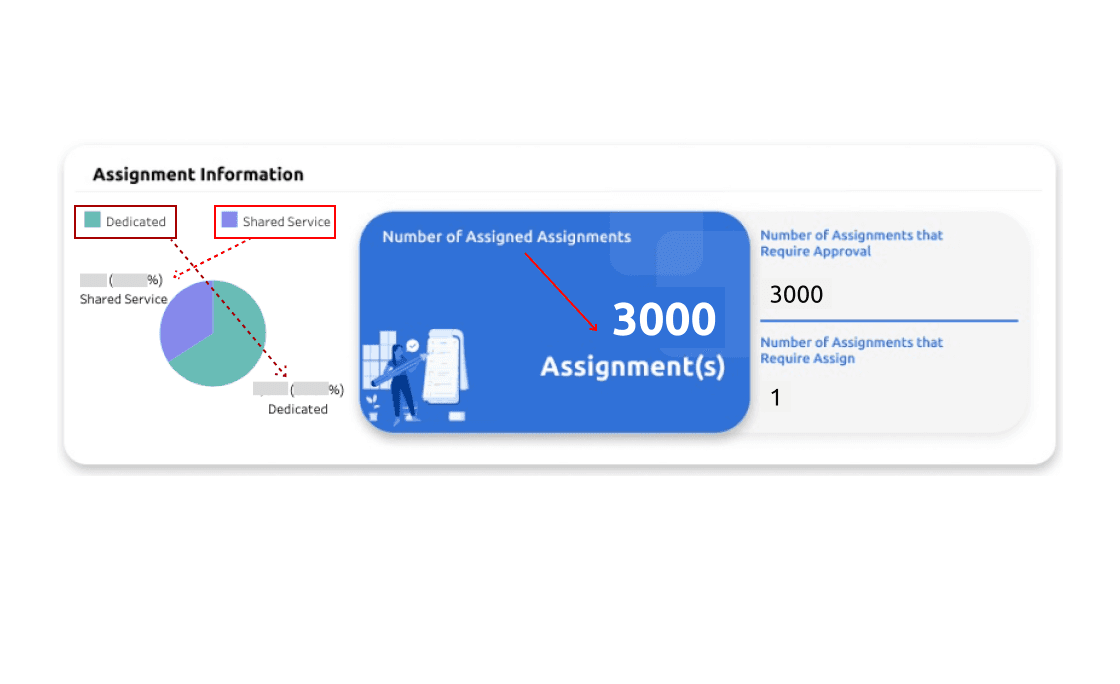
Picture the challenge when confronted with overlapping categories like "dedicated" and "shared services." This overlap often leads to confusion, making it difficult to accurately interpret the data.
Additionally, when examining the "Number of Assigned Assignments," there’s no clear reading pattern, further complicating the analysis. Although the numerical representation of assignments offers some clarity, it’s not enough to establish a consistent reading flow.
These issues highlight the importance of having a well-structured and intuitive data presentation. By addressing these challenges, stakeholders can gain better insights and make more effective decisions.


#2 Problem Statement: Poor Color Contrast
#2 Problem Statement: Poor Color Contrast
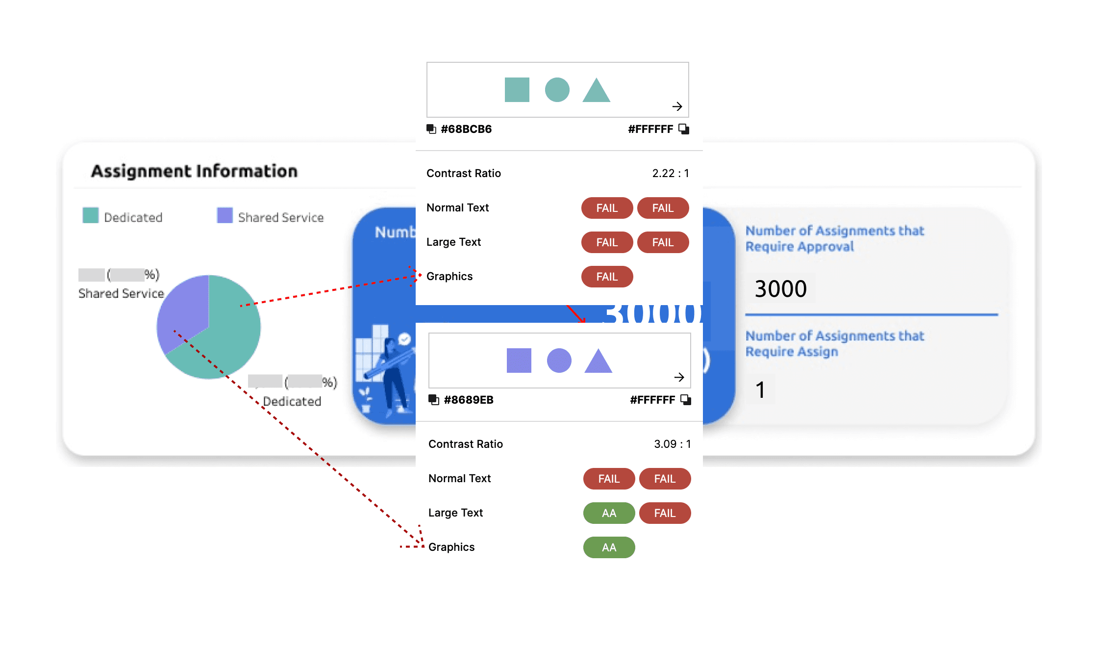
I set out to investigate whether the colors used had sufficient contrast. Using a plugin in Figma,
I conducted my experiment and discovered that one color lacked contrast both graphically and in text, while another color failed the contrast test specifically for text.
These findings align perfectly with the hypothesis I had formulated earlier


#3 Problem Statement: Small Text
#3 Problem Statement: Small Text
The font used to present data and information is not just too small, but also too thin, making it hard to read comfortably.
When the text is too tiny, users have to put in extra effort to decipher it, which can lead to discomfort and potential errors in understanding the information. This diminishes the overall experience and can be frustrating.
Moreover, small font size greatly reduces visibility, especially when trying to read detailed data explanations. It's essential to ensure that text is both readable and comfortable to view, enhancing the user's ability to interact with the information effectively.


Solution: Armed with insights, crafted a new approach
Solution: Armed with insights, crafted a new approach
Several design solutions that i can be implemented based on the problem statement studied:
Informative: Adding infomation provided users with detailed statistics at a glance, reducing information overload.
Larger Text: By increasing the text size, i ensured readability and hierarcy.
Better Color Contrast: Utilizing our brand's blue color palette, i created a more visually distinct pie chart.
#1 Deliver: Informative Tooltip
#1 Deliver: Informative Tooltip
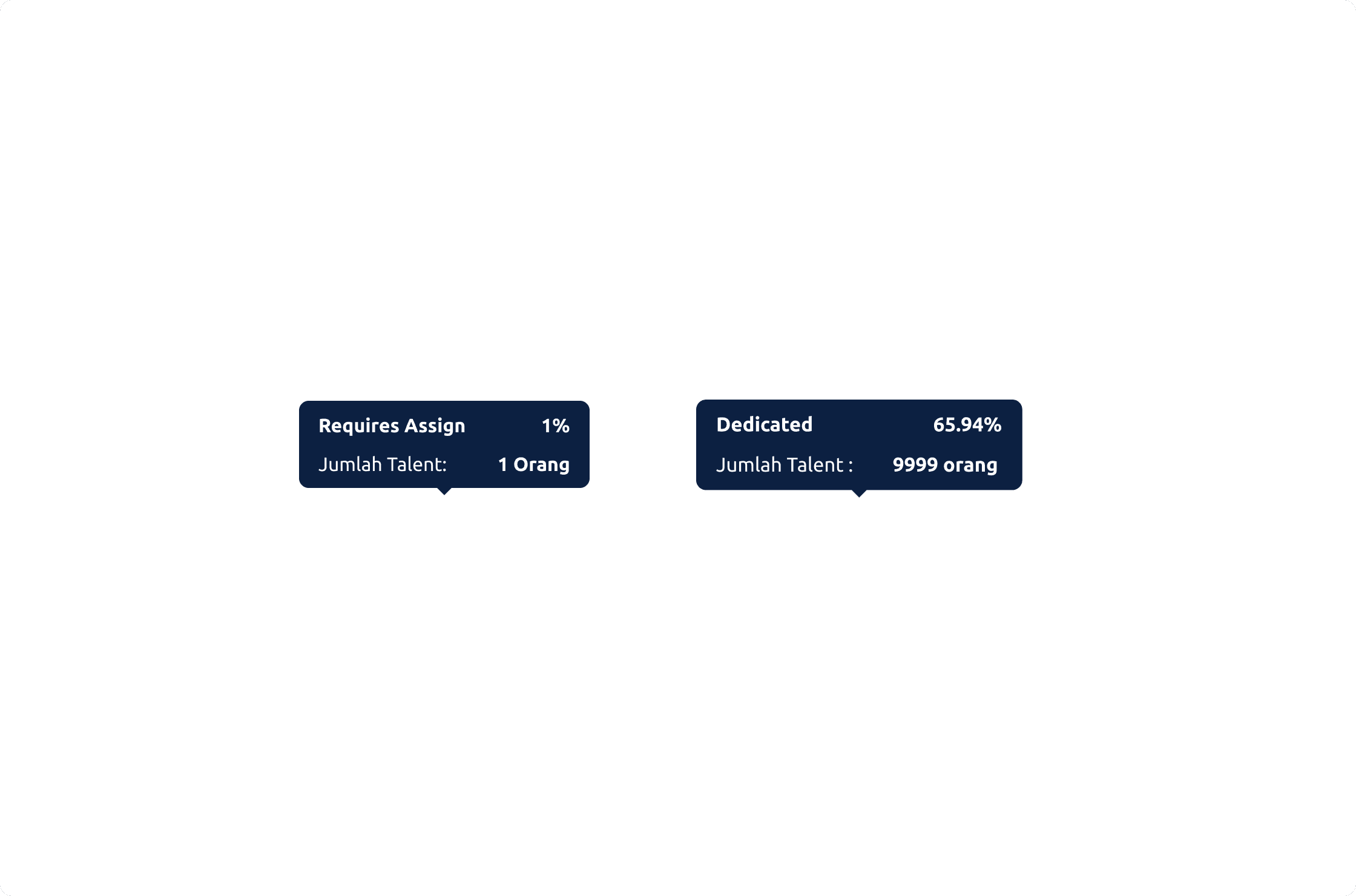
Users were struggling with scattered content, finding it challenging to make sense of information that seemed too far apart, poorly grouped, and information overload.
During a brainstorming session, I envisioned a solution that would guide users through the content without overwhelming them.
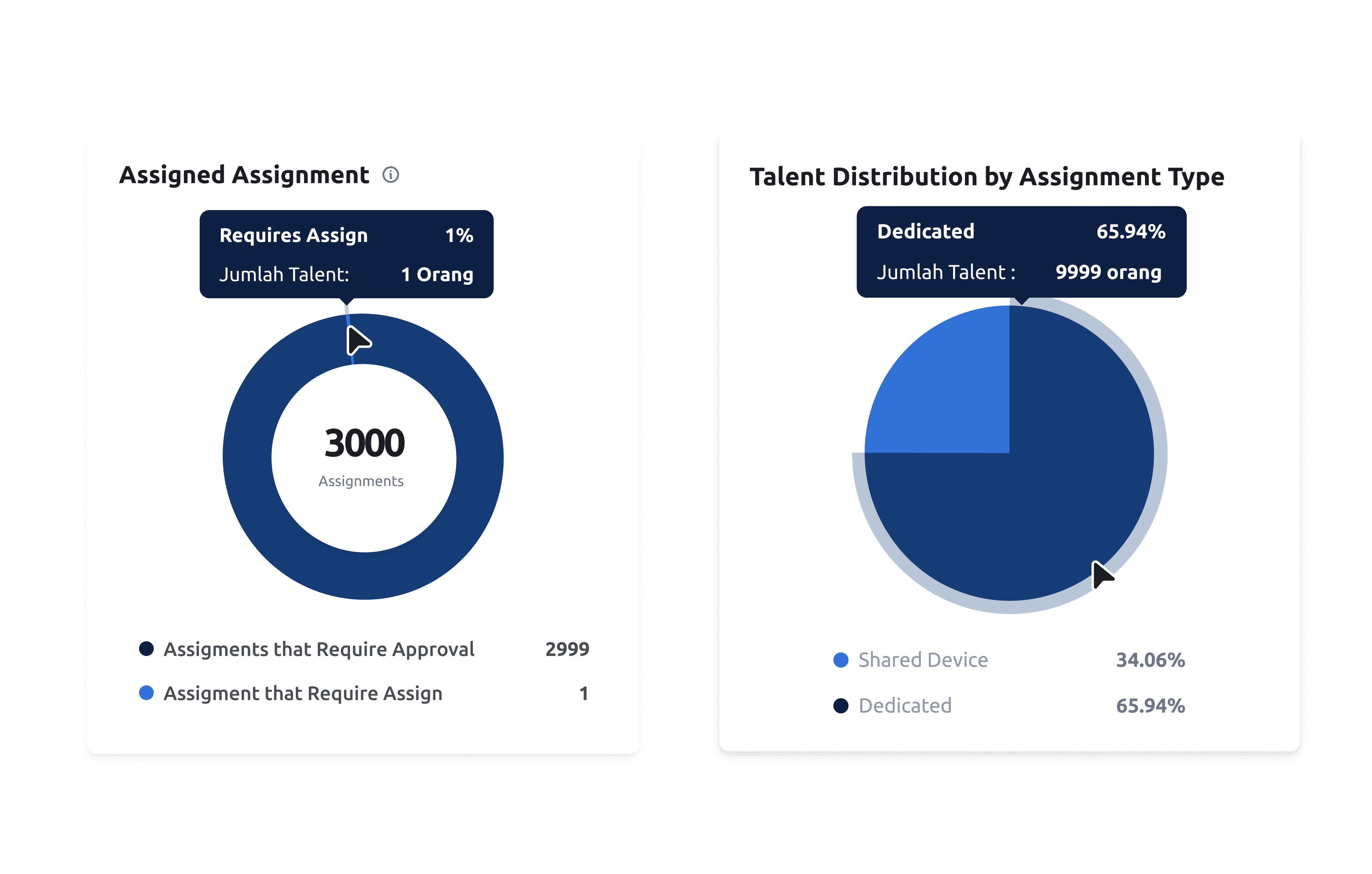
By incorporating tooltips, I created a smoother reading experience, ensuring that data was presented in a clear, contextual manner. This way, users could easily follow the information flow, with each piece of data seamlessly connecting to the next.


#2 Deliver: Better Color Contrast
#2 Deliver: Better Color Contrast
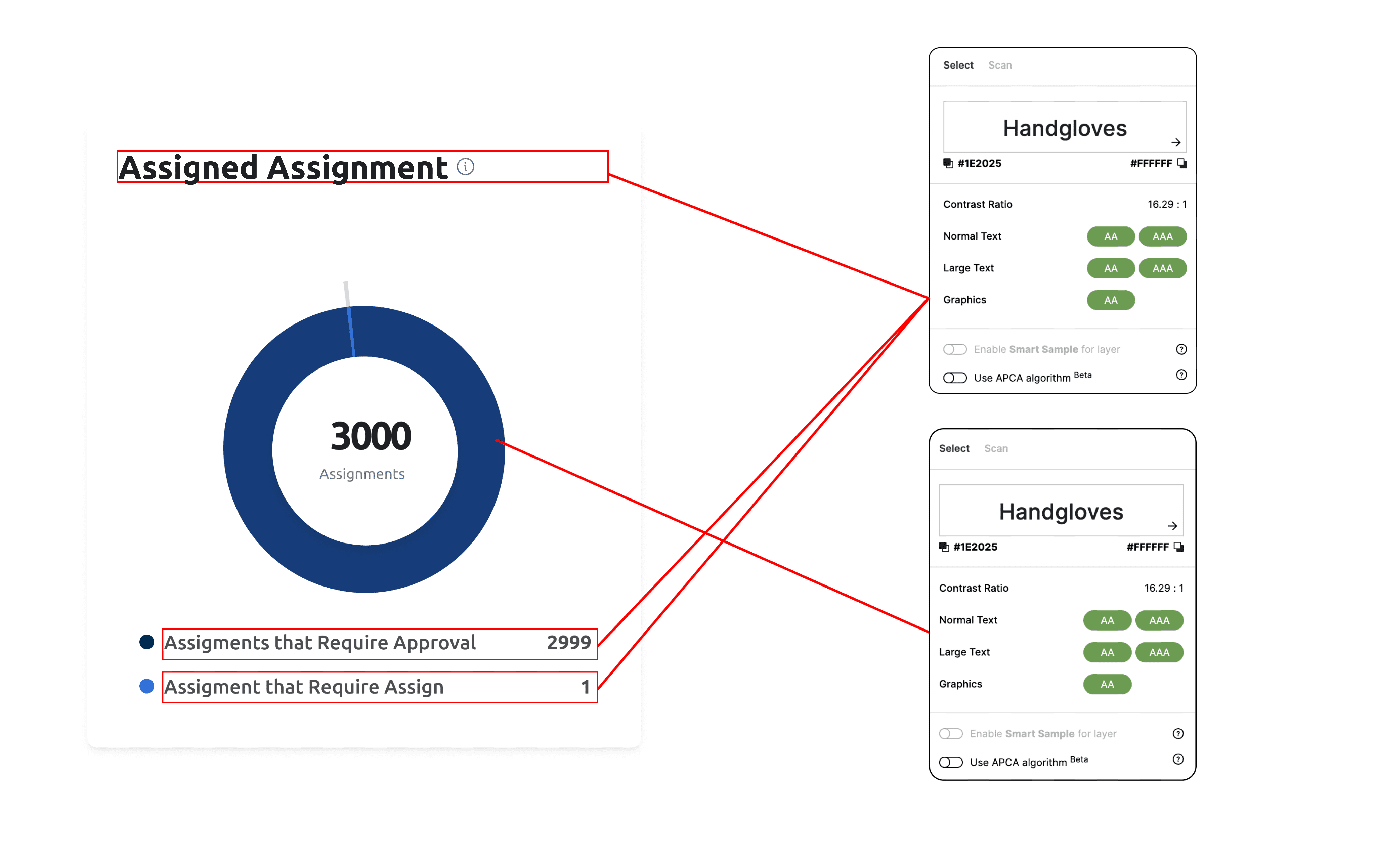
Drawing inspiration from our brand's blue color palette, I crafted a pie chart that not only stands out visually but also ensures clarity and accessibility.
The blue shades were meticulously chosen and tested for contrast, ensuring that even when transformed to grayscale, the chart remains distinct and easily interpretable.

#3 Deliver: Larger Text for Readibility
#3 Deliver: Larger Text for Readibility
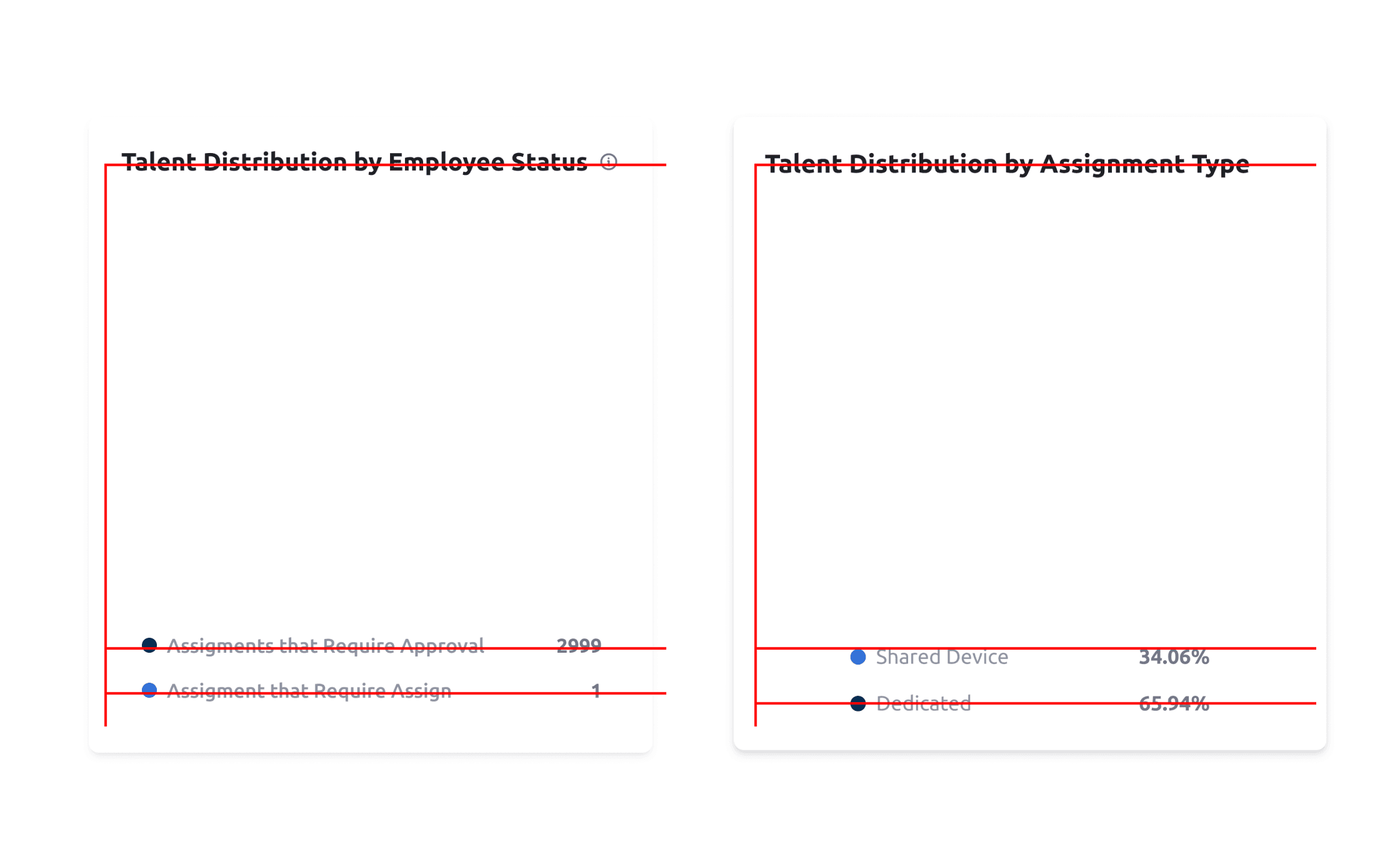
To enhance the user experience, i concentrated on making data easier to read by increasing text size.
By doing so, i ensured that readability and hierarchy were significantly improved with F patern, allowing users to effortlessly access the information they need.
There are 2 types of cards: separated because each provides different information:
Talent Distribution by Employee Status: Digital taelnt distribution based on their type of work: dedicated and shared service.
Talent Distribution by Assignment Type: Digital talent distribution based on their distribution to other tribes (tribe = sub-business Telkom companies)


Outcomes: Readbility, Clarity, and effectivity
Outcomes: Readbility, Clarity, and effectivity
The several conculision was profound by stakeholder with new design:
Effectivity Information Access: Tooltips offered immediate, clear data without cluttering the chart.
Enhanced Visual Clarity: Contrasting colors helped users (stakeholder) quickly differentiate sections.
Improved Readability: Larger text made the chart accessible to all users (stakeholder).
Result of Design
Result of Design
Here is a result of new design by all the process👇🏻
Here is a result of new design by all the process👇🏻


What I've Learn
What I've Learn
Accelerating the design team's work with tight deadline (3 days).
Delivering design outcomes swiftly upon request (Design and Research Leadand realted stakholder).
Determine what chart is appropriate based on goals and objectives (Data Visualization)
Always build comunication with team Design
Accelerating the design team's work with tight deadline (3 days).
Delivering design outcomes swiftly upon request (Design and Research Leadand realted stakholder).
Determine what chart is appropriate based on goals and objectives (Data Visualization)
Always build comunication with team Design
Thank you
Thank you
Look Another Works
Look Another Works
Here are some designs I've created while in Codex Telkom👇🏻
Here are some designs I've created while in Codex Telkom👇🏻
Comparation Year To Year With Bar Chart
Comparation Year To Year With Bar Chart
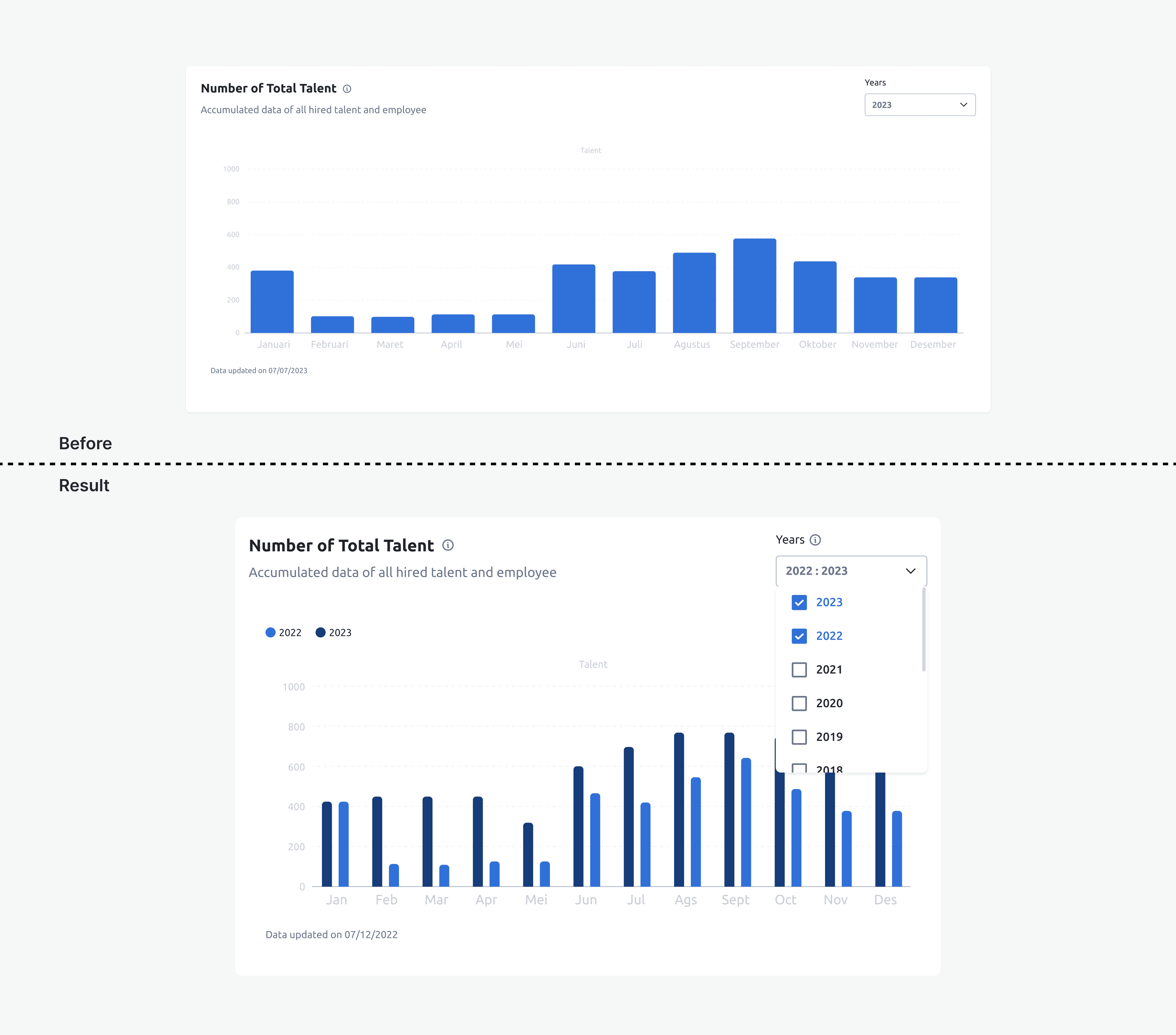
The user needs to display a data trend comparison year by year and month by month within a year.
I began with one sentence: How might the user compare data with multiple years on one card containing multiple bars?
So, the result is to create multiple-choice checkboxes for years.

Make Prototype For UsabilityTesting
Make Prototype For UsabilityTesting
I created a prototype for future usability testing.
This is one prototype out of several Talent Management System (TMS) dashboard User Management prototypes (to maintain company confidentiality, I'm only showcasing this one).
The main goal is manage user who can access the entire dashboard codex.
Result: the SUS Score of usability testing user access managament increase from 42 to 82.5
Edge Case: Inform User What Happend
Edge Case: Inform User What Happend
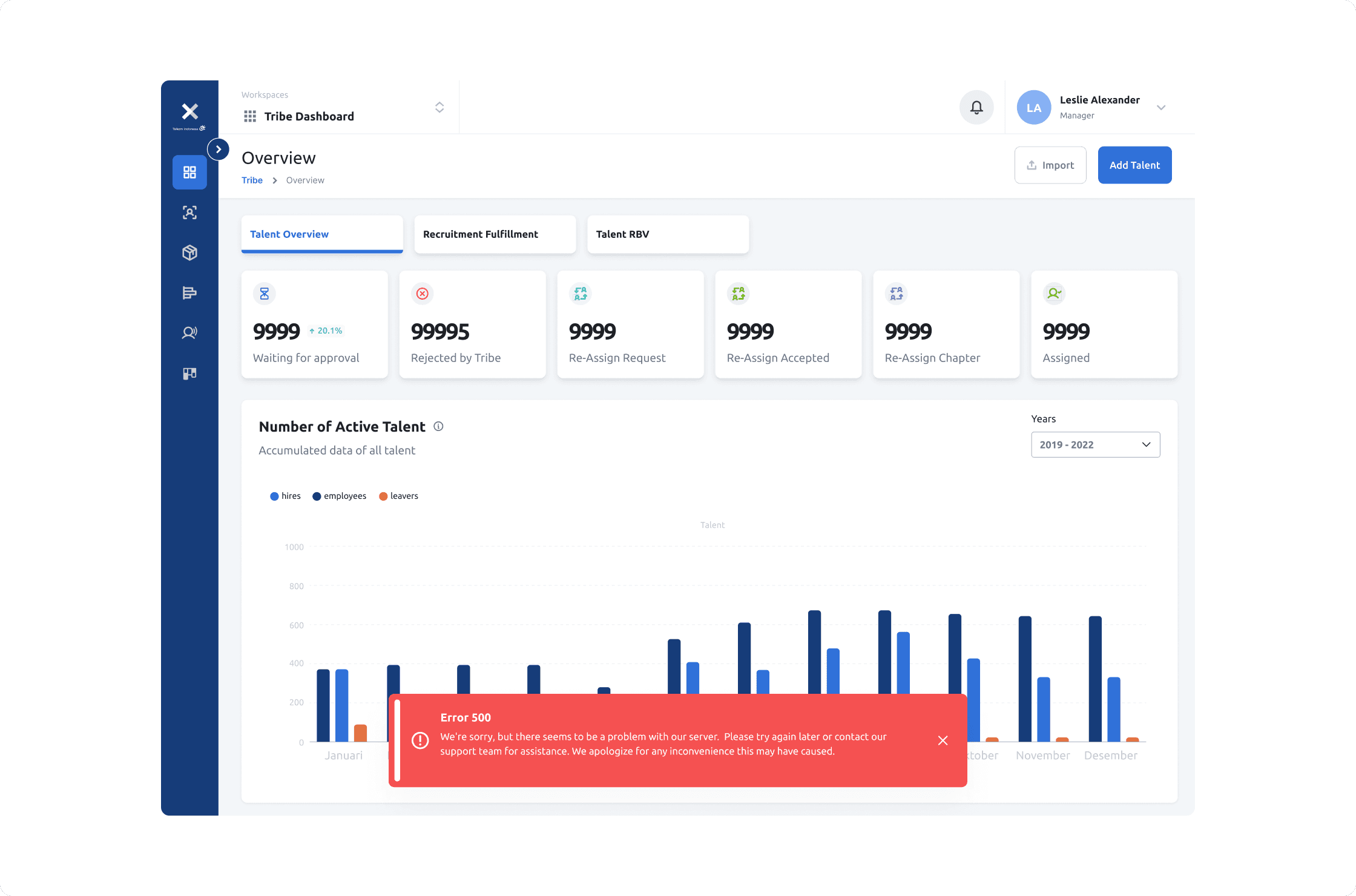
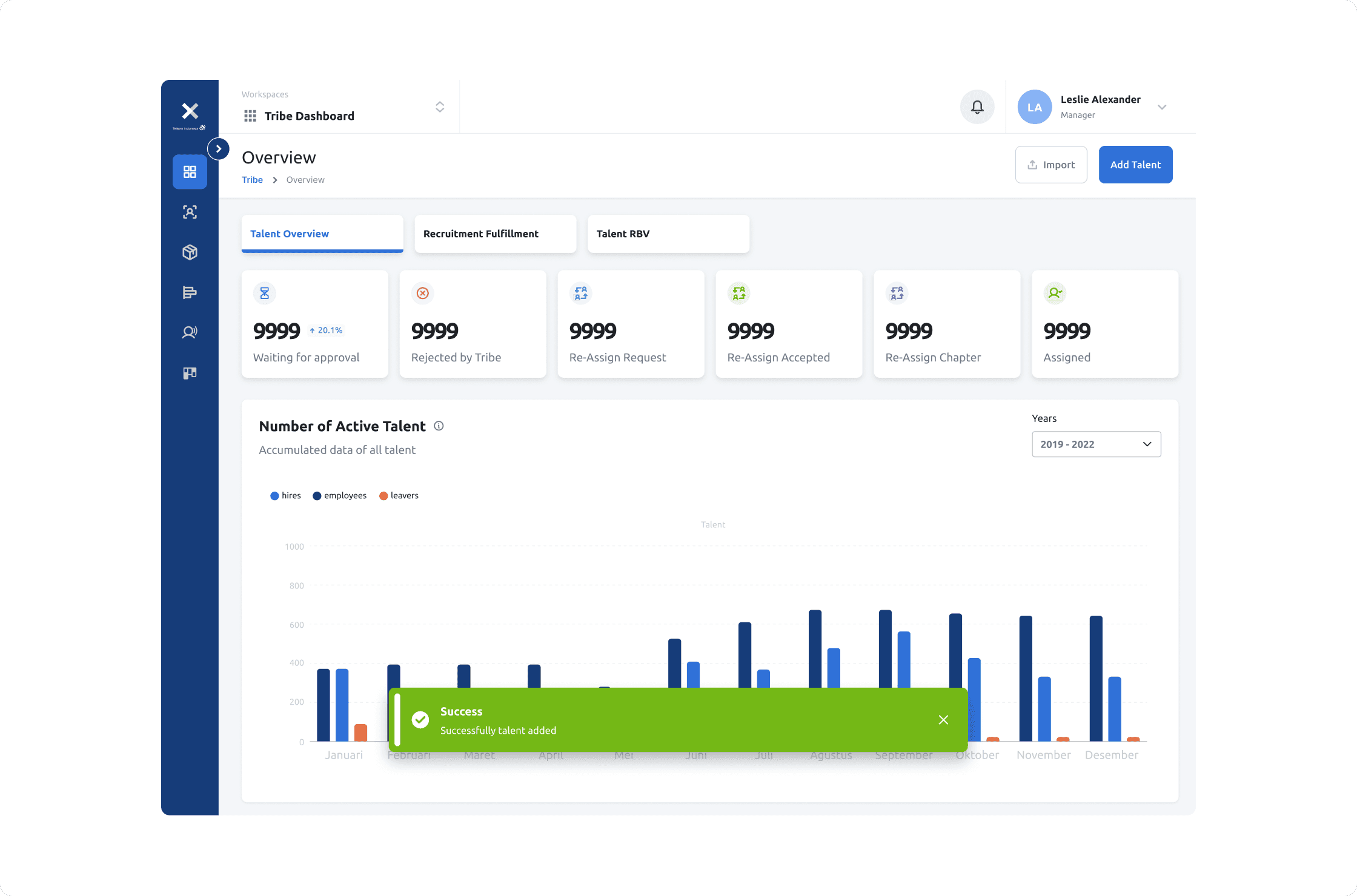
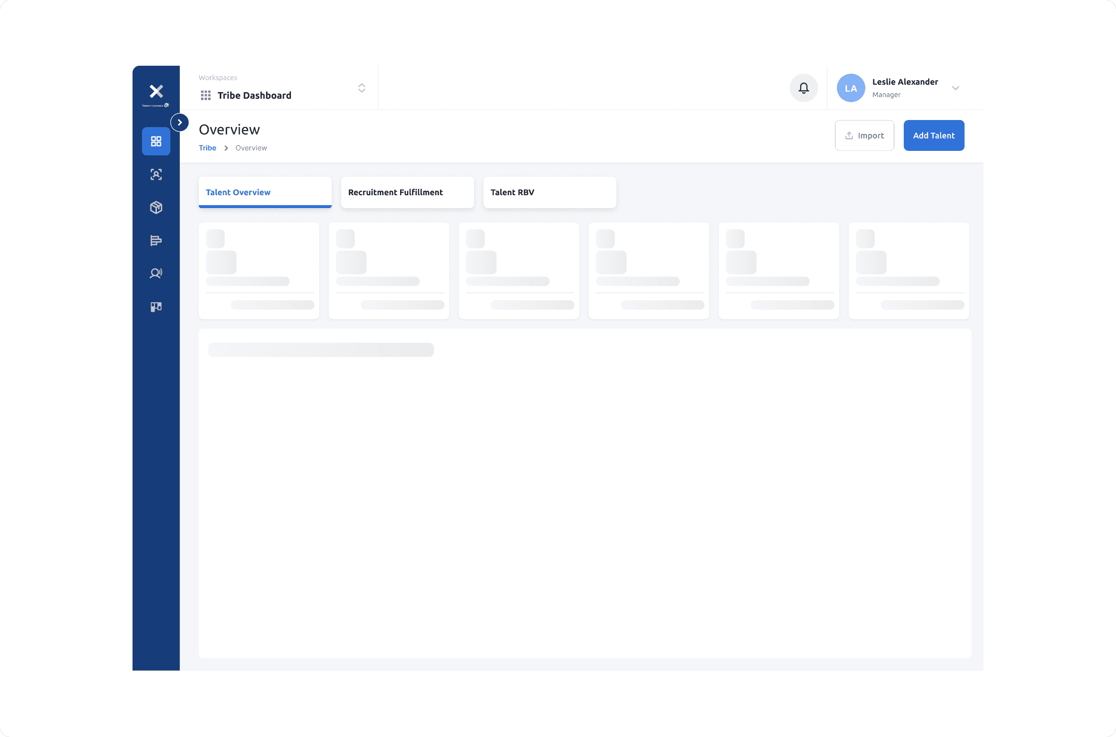
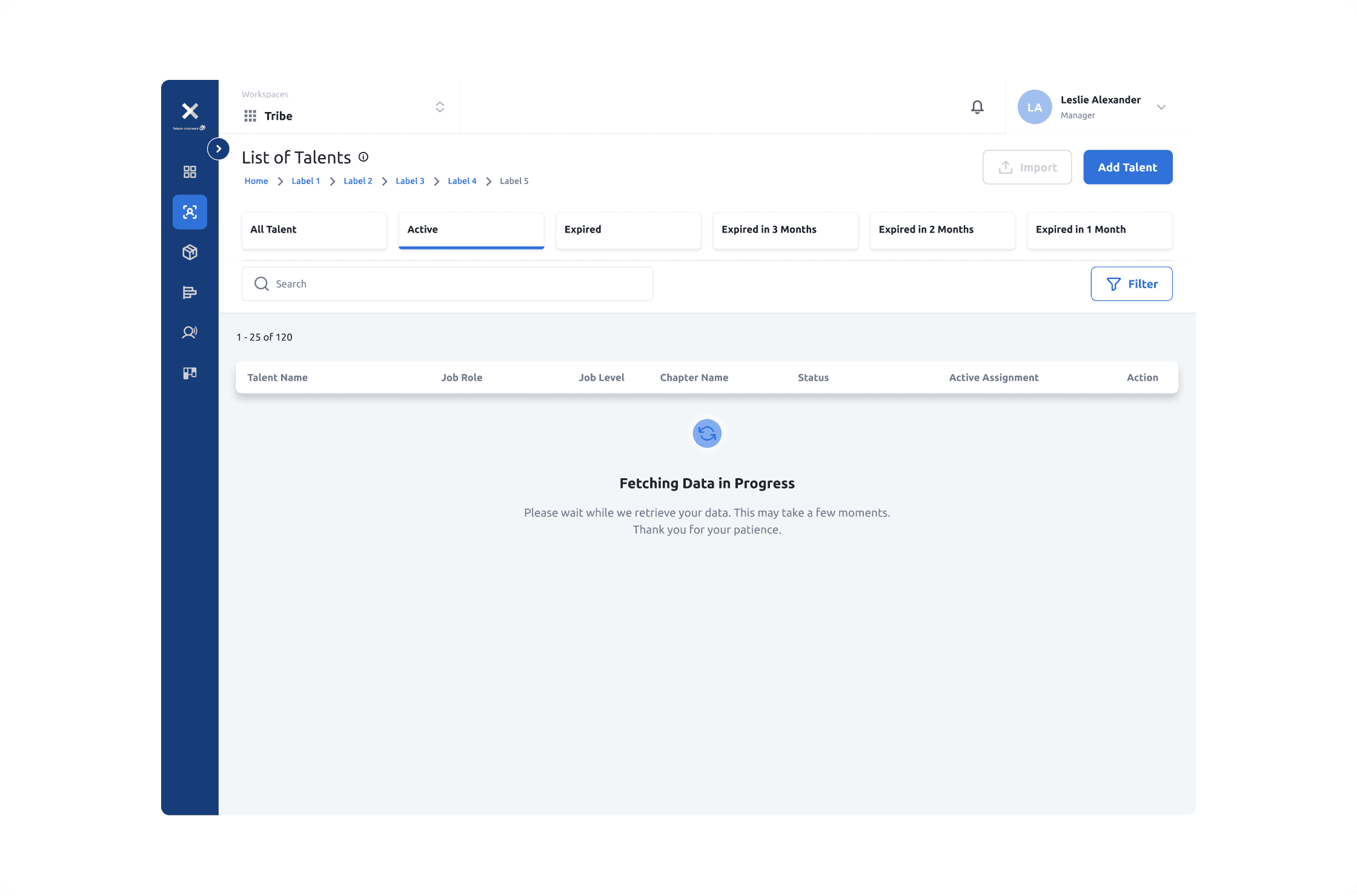
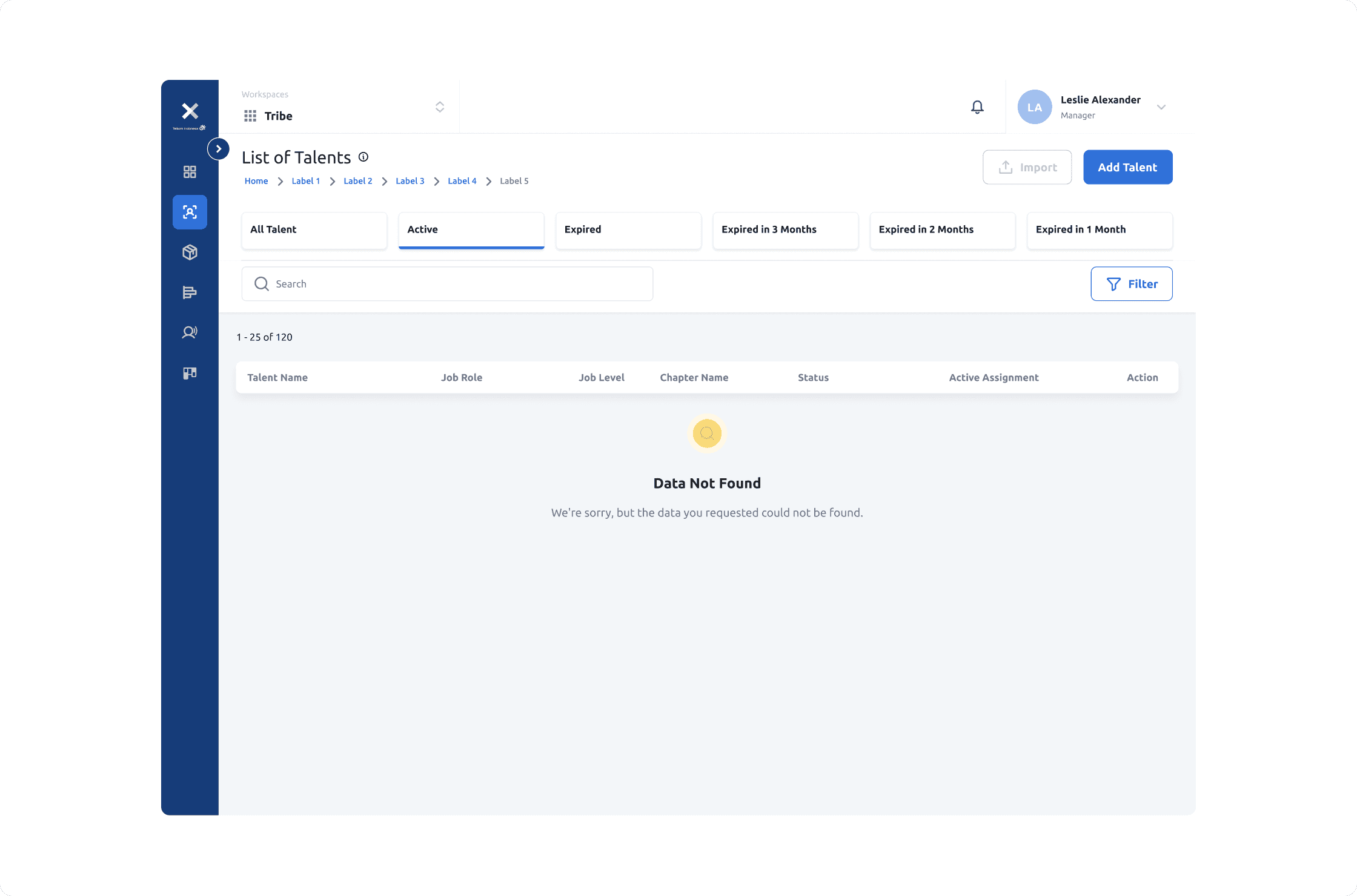
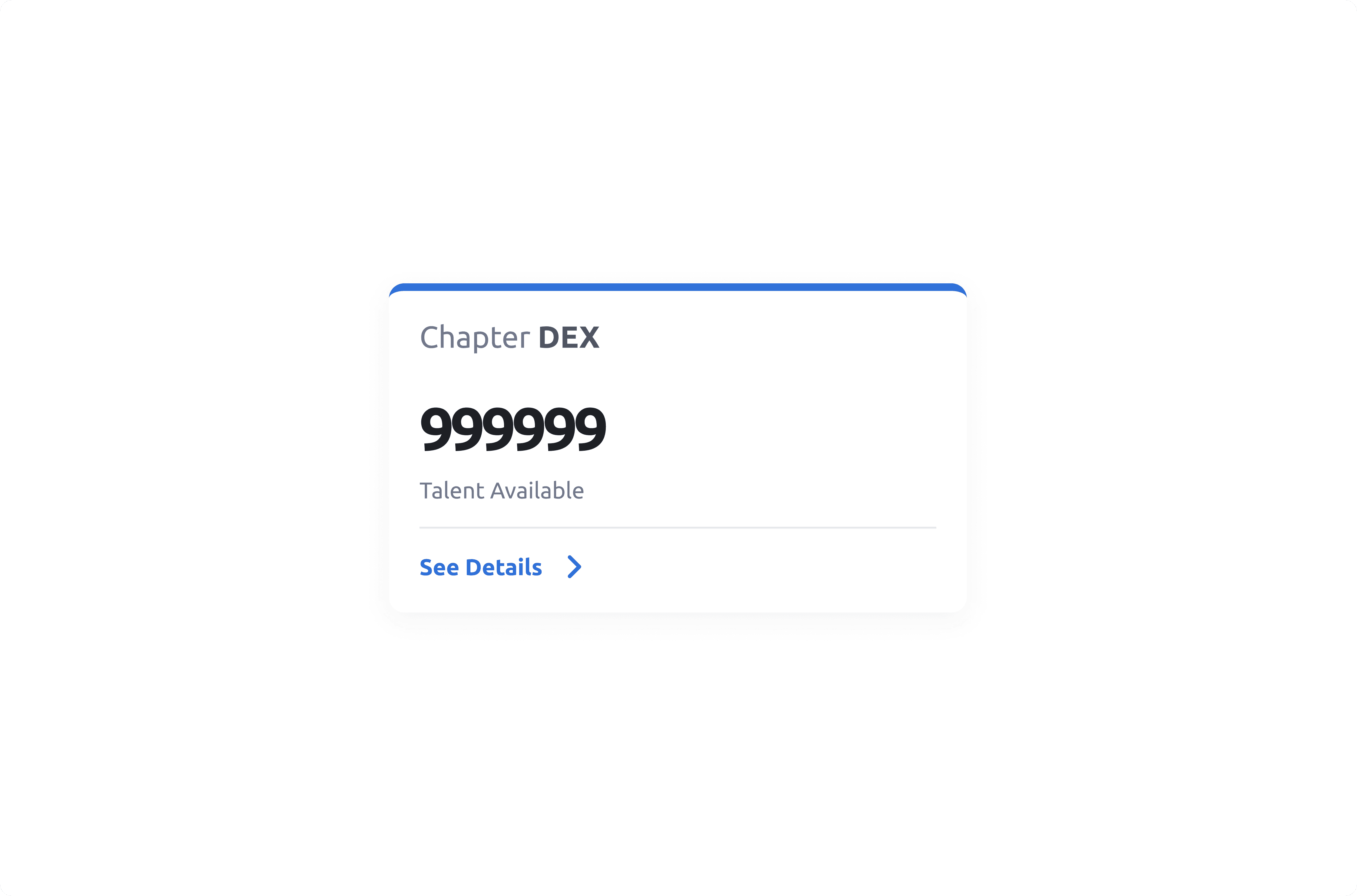
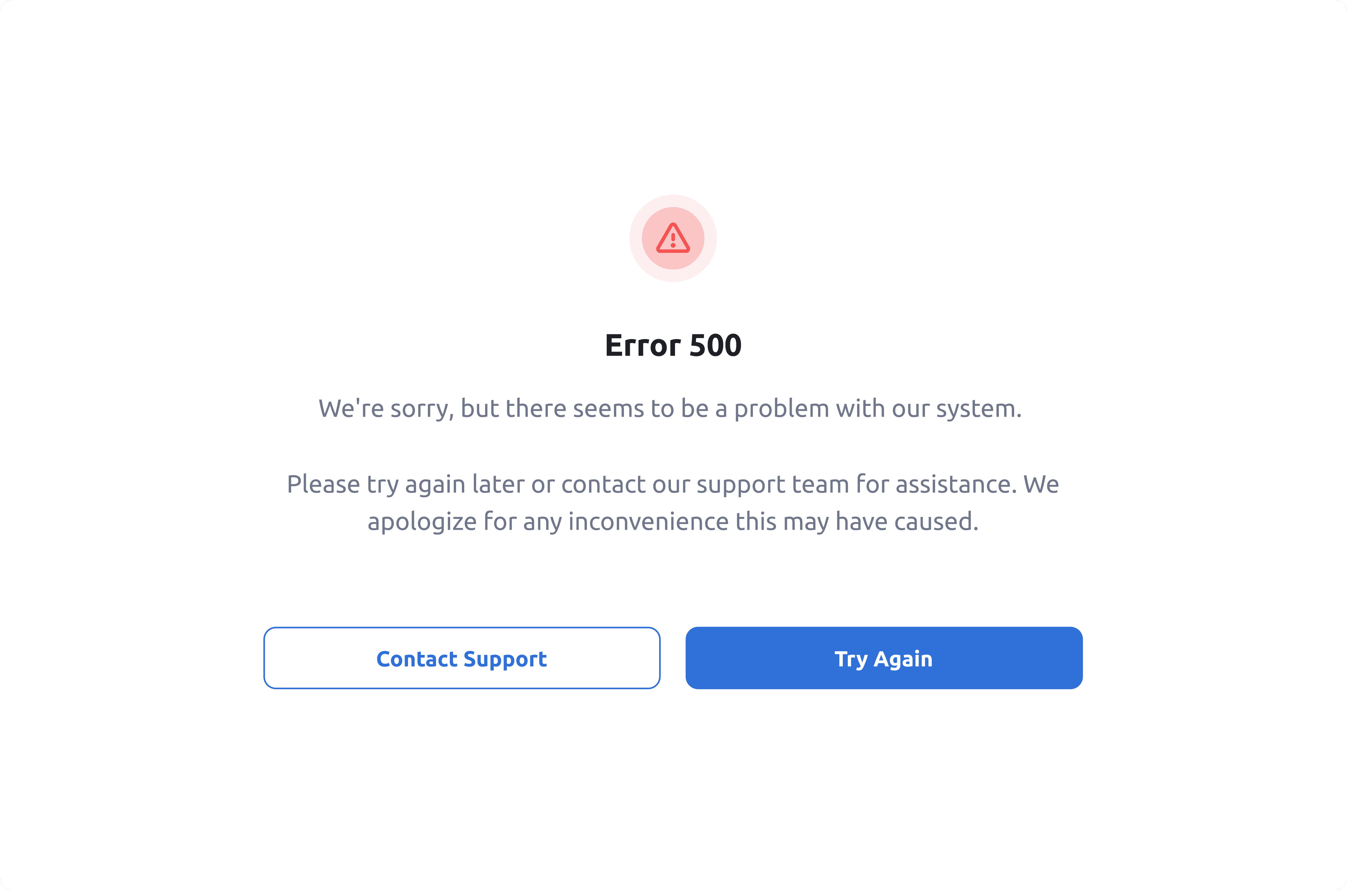
The dashboard needs to inform users about what happened when they took action.
Therefore, I have created an edge case that includes: error, success, fetch, or empty to notify users that something happened while they were taking action on this.
The dashboard needs to inform users about what happened when they took action.
Therefore, I have created an edge case that includes: error, success, fetch, or empty to notify users that something happened while they were taking action on this.
