

Office Buddy
The Journey to Create Office Booking Apps
角色
UI/UX Designer
描述
The project collaborate with another departmen. My team have found several problem from user to book office. We try solve the problem that we gather from research.
Lets Get Started👇🏻🔥
I successfully led the research, end-to-end design process, and managed this project until handling it off to the developer.
Modern and flexible offices were becoming increasingly popular in this era. Many businesses and organizations were transitioning to offices that could be used flexibly and shared among teams.
This rising demand occurred because many businesses were starting to adopt remote work policies, reduce office rental costs, and prioritize employee well-being by providing comfortable and flexible office spaces.
We used generative research approach at the early stage of product or project design to gather inspiration and identify problems that could be transformed into design concepts.
We began exploring user ideas and issues by conducting in-depth interviews, aiming to delve deeper into their perspectives on booking office spaces. S

Each member of our team was conducting in-depth interviews with one to five respondents. In total, the team interviewed 15 respondents.
While conducting data collection through in-depth interviews, our team was discovering a multitude of diverse problems.
Therefore, we created user personas. The reason was to ensure that the problems encountered and the proposed solutions were user-centered and aligned with the insights gathered from our in-depth interviews.
Each member of team team created user persona. We created five user personas, each with their own insights and frustrations, based on the research (In-depth Interview) we conducted.

I also realized that we were experiencing a great deal of frustration and insights from our users.
I was contemplating how to uncover the common thread or the most prevalent frustation faced by our users or potential users.
The goal was to craft a precise frustation and address the most critical issues our users were facing with our product first and foremost.
While we were clustering data based on user personas, we were uncovering insights that revealed the unique behaviors and needs of different user segments.
We noticed that the user personas we created shared a common trait: they experienced frustration whenever they tried to book an office or co-working space.
We noticed that the user personas we created shared a common trait: they experienced frustration whenever they tried to book an office or co-working space.

We were starting cluster the frustrations of our user personas because it would speed up our workflow.
This approach allowed us to organize the insights we gathered and turn them into actionable solutions.
In the cluster problem we created, we observed the frustrations experienced across several pain points (problem dimensions) based on user persona.

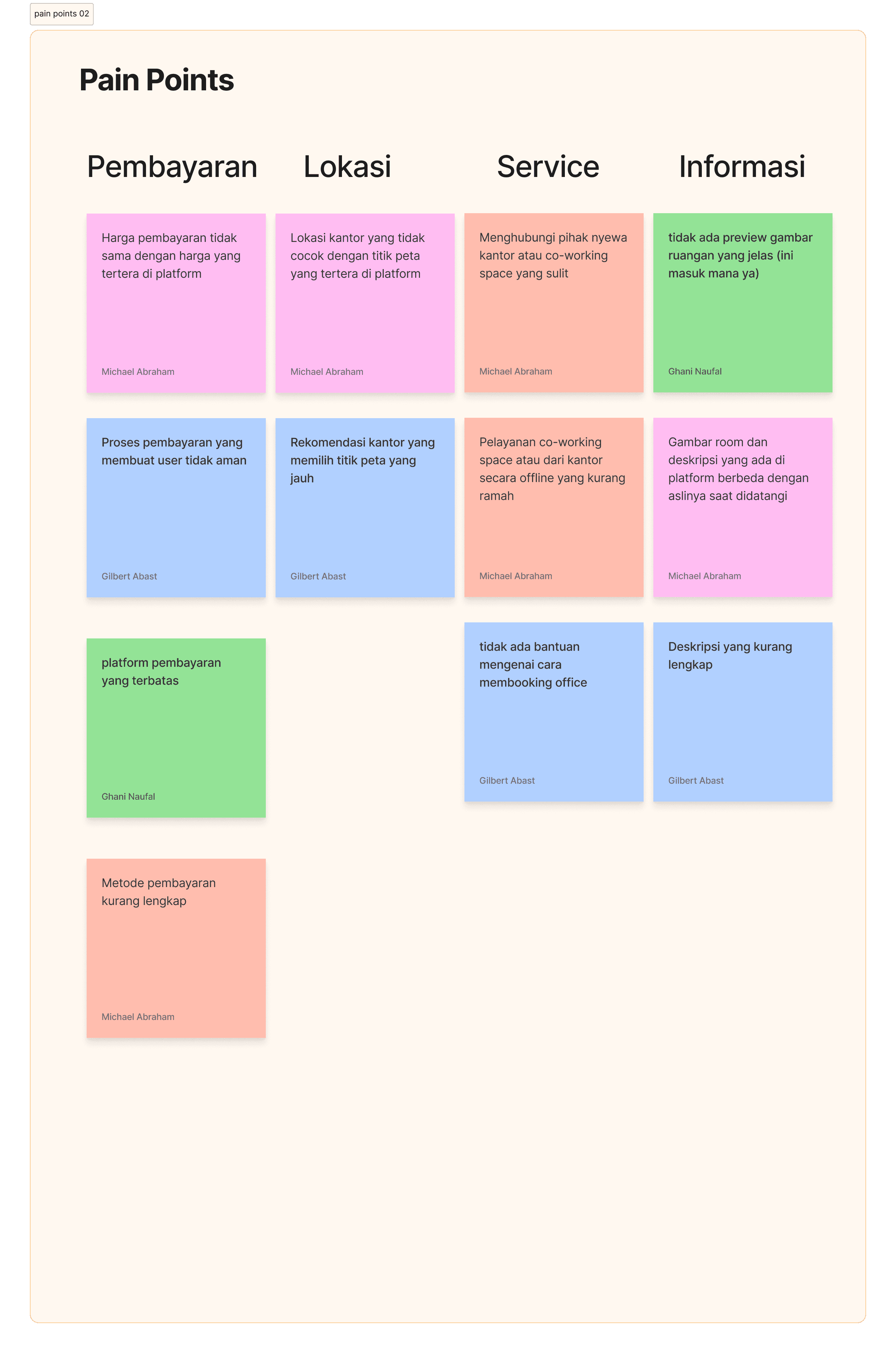
After several brainstorming with my team, we add some group for our pain points or frustation:
Schedule: The schedule, which had been previously booked, often changes, and rescheduling is still done manually through chatting with the admin.
Facilities: The details of the available indoor facilities, such as whiteboards, extension cords, and other amenities, are not included in the description of the space.
Booking Process: The complicated booking process, which is often cluttered with other bookings and canceled by one party, along with the uncertain availability of co-working spaces or offices, and the difficulty in booking due to inactive contact information, contributes to a convoluted reservation flow.
Payments: The payment process on the platform feels insecure due to discrepancies between listed and actual prices, limited payment options, and incomplete payment methods.
Location: The office location does not match the map point indicated on the platform, and the recommended office is situated far from the selected map point.
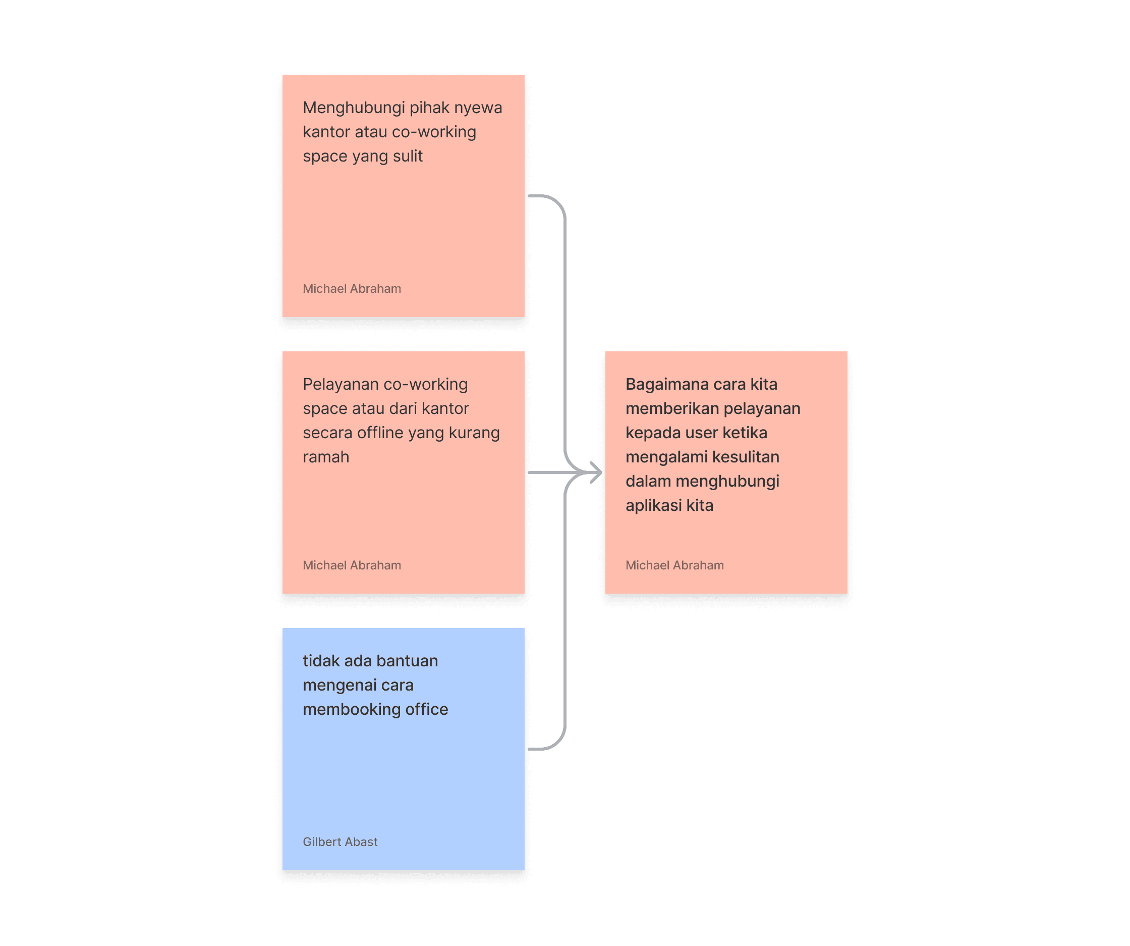
Service: Contacting office rental or co-working space providers can be difficult due to unhelpful offline service and a lack of assistance with booking procedures.
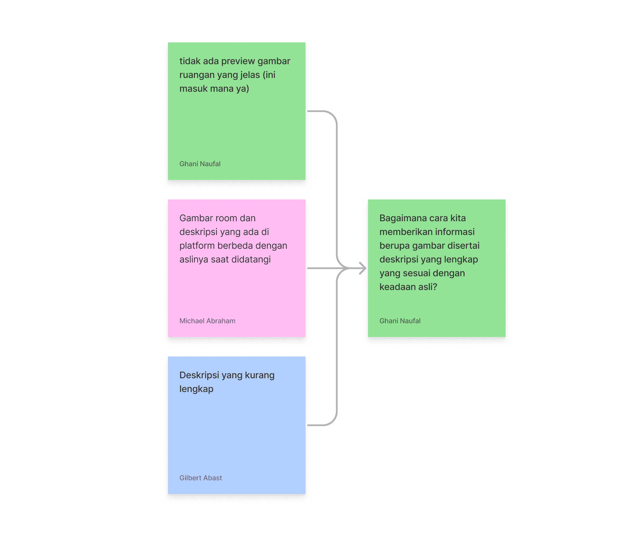
Information: There is no clear preview of the room, and the images and descriptions on the platform differ from the actual appearance upon arrival, with the descriptions being incomplete.
We challenged ourselves.
We are thinking to overcome frustation and problem user by using the How Might We method for efficiency and speed was incredibly useful in solving the problem.
Firstly, we did this by clustering the identified pain points before and transforming them into How Might We questions.
This approach allowed us to uncover solutions to the problems effectively.


After clustering the pain points and formulating our How Might We questions, we began addressing these questions with various versions from our team.
During a long brainstorming session, we eventually unified as a team and generated a solution idea to answer our How Might We questions.
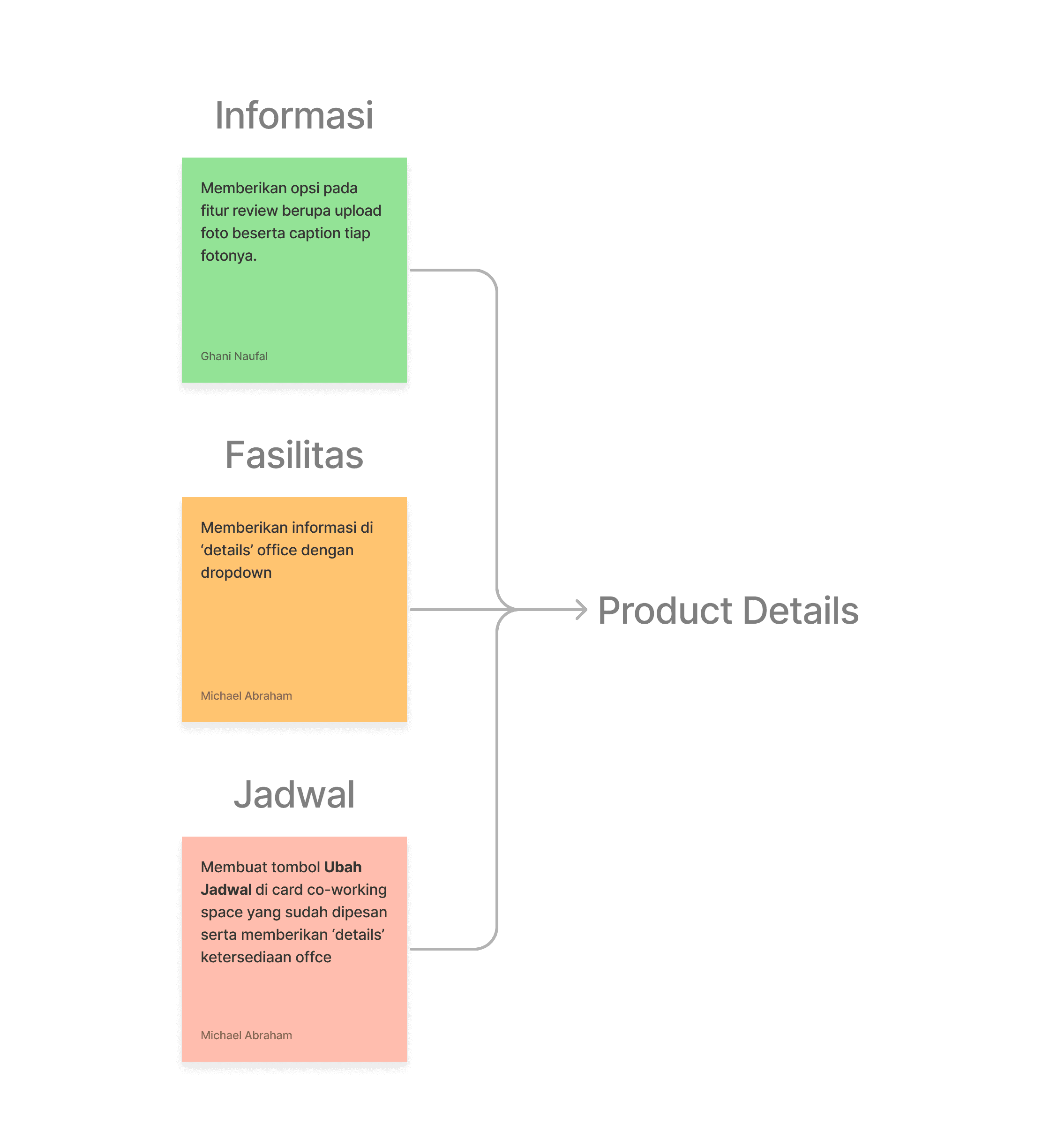
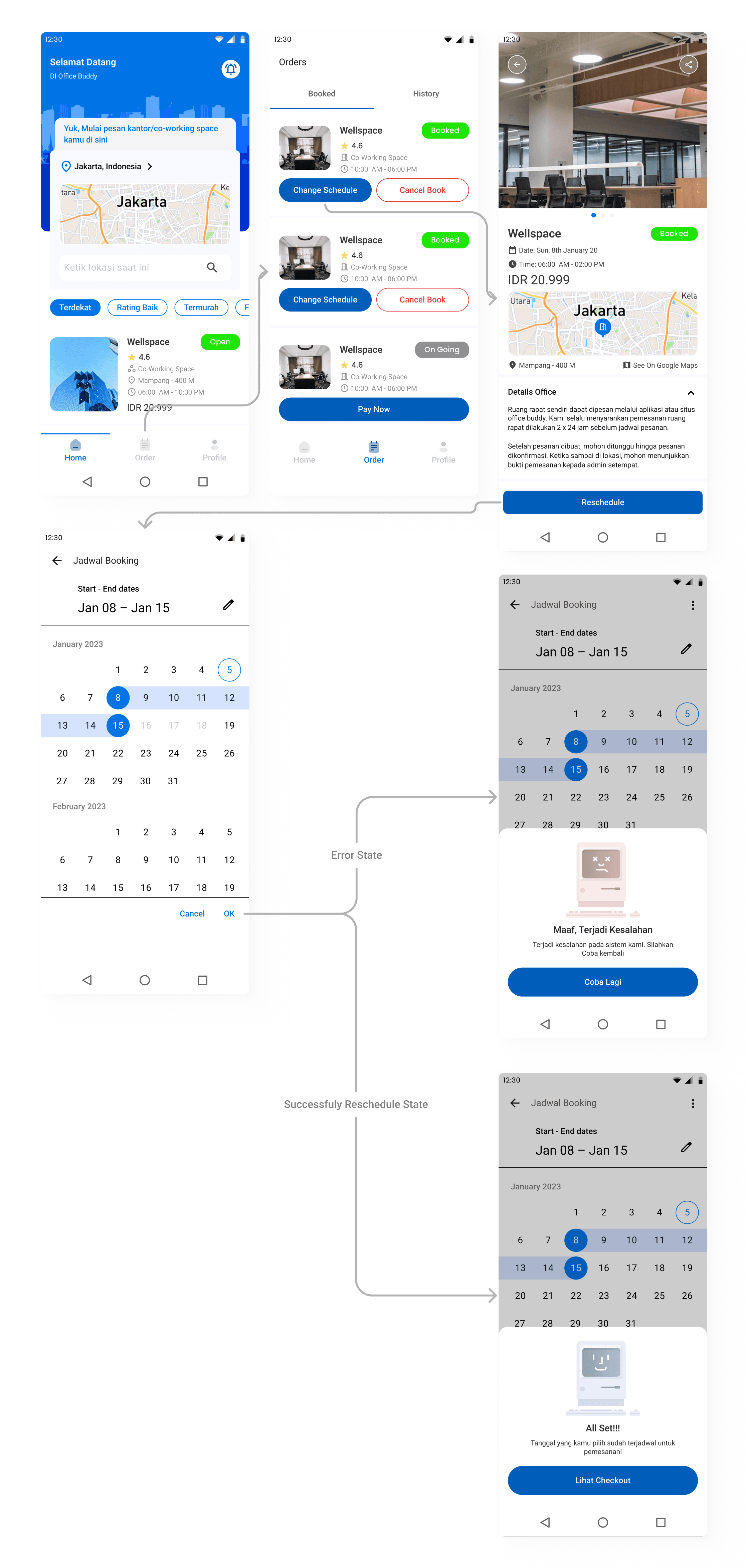
Create a Change Schedule button on the co-working space card that has been booked and provide 'details' of office availability
Provides information in the 'details' office with a dropdown
Create a short but clear booking flow and provide confirmation to users regarding canceled bookings
Create a price breakdown feature that includes additional costs (tax, service, etc.)
Creating a Help Center Menu containing FAQs or "contact us" to the app and the space/office owner.
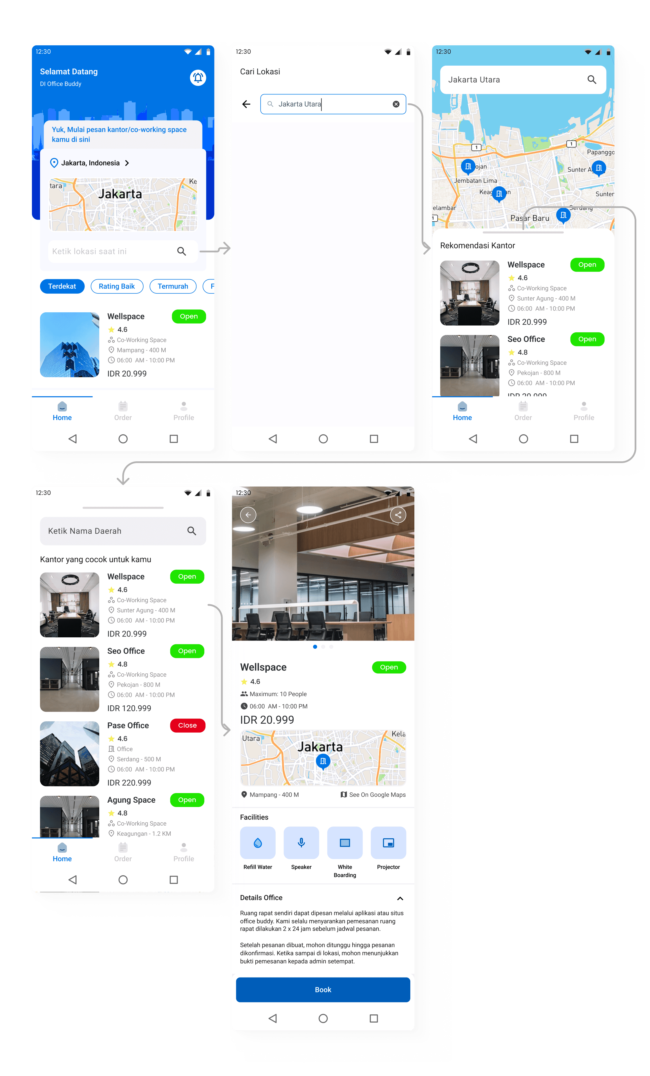
Create a feature that recommends the closest office to the user on the homescreen using Google maps
Provides an option in the review feature in the form of uploading photos along with a caption for each photo.

Out of the seven solutions we developed, we noticed a tendency for repetition, with several solutions being nearly identical and applicable in similar ways.
Therefore, we revisited our approach and created an affinity diagram to cluster or group the similar solutions. This ensured a more efficient and effective implementation in the MVP later on.
We were grouping the schedule, information, and facilities into product details.
This was done so that users or potential users could view the schedule, information, and office or co-working space facilities all on a single details page.
The location and service were the key points where users frequently engaged to book offices or coworking spaces.
We clustered these elements together to create a unified in home screen. The goal was to ensure that users could instantly access the booking features without having to search for distant locations.
We added search bar in home page for additional navigation.
Based on our How Might We. We still keep the payment's grop to next phase for designing.
Same as the payment. We still keep the ideas booking process's group for next phase of designing.

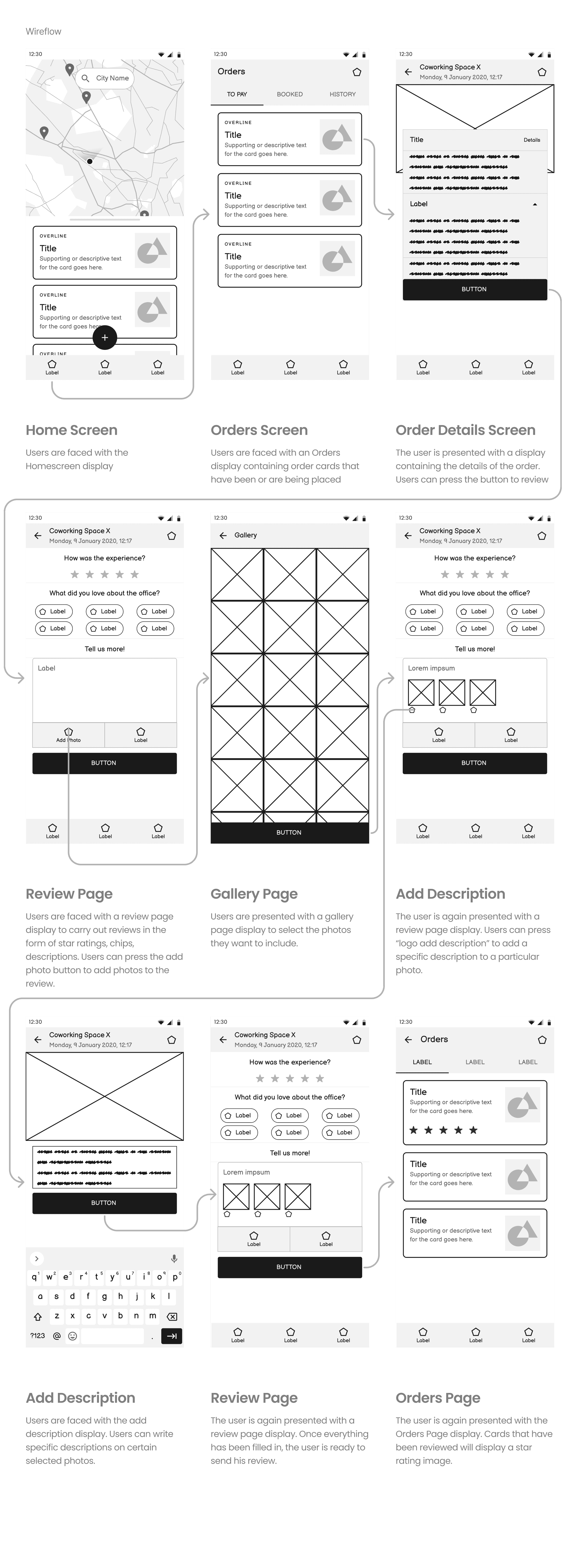
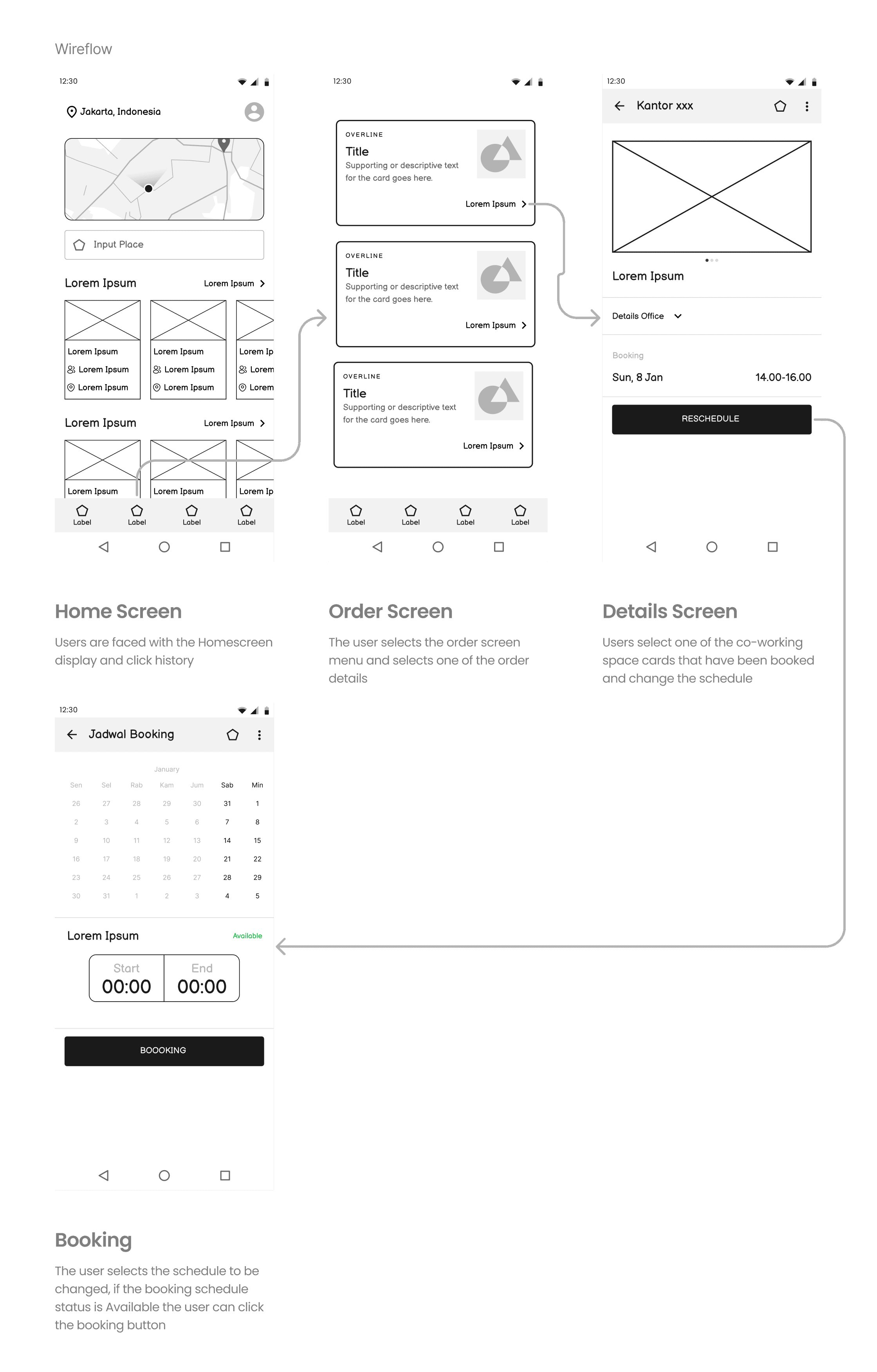
From the process that included identifying pain points, formulating "how might we" questions, and developing solutions from the affinity diagram, we were misxing the User Flow and Wireframe into Wireframe-Flow (wireflow) based on the solutions we had generated.
This Wireflow aimed to convert our solutions into a sequence that would serve as our guide in creating high-fidelity designs.
We were focusing on the wireframe and flow to ensure that users could clearly, safely, and securely view the offices and co-working spaces based on the solutions we provided.
Provides information in the 'details' office with a dropdown

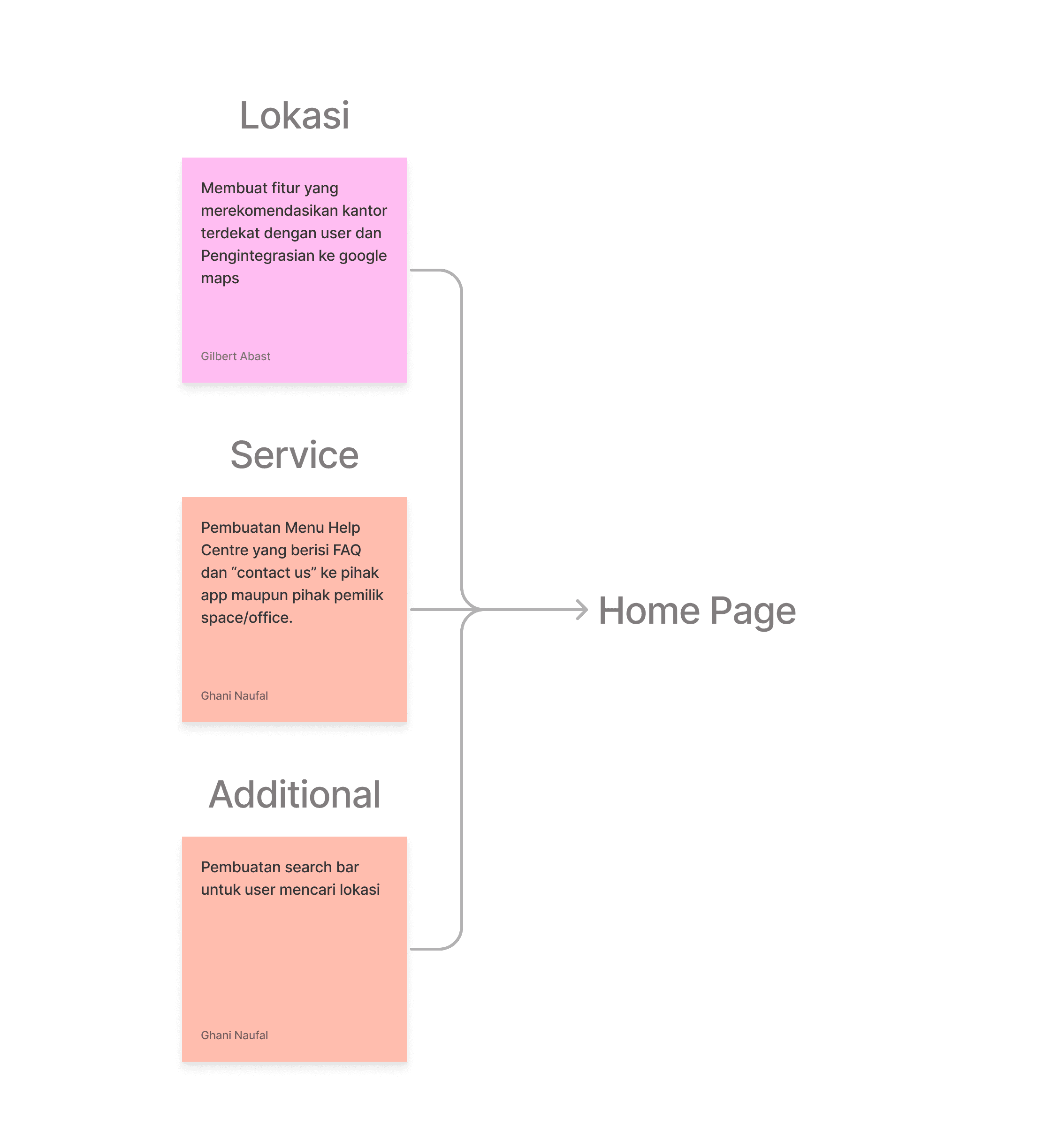
Our team focuses on this homepage that users can immediately order or book the nearest office or co-working space quickly. Creating a flow wireframe combines Location, Contact Us, and Service into the same flow.
We are creating a feature that recommends the nearest office to the user and integrates with Maps, developing "contact us" options for both the app and office space owners, and implementing a search bar for users to find near locations.

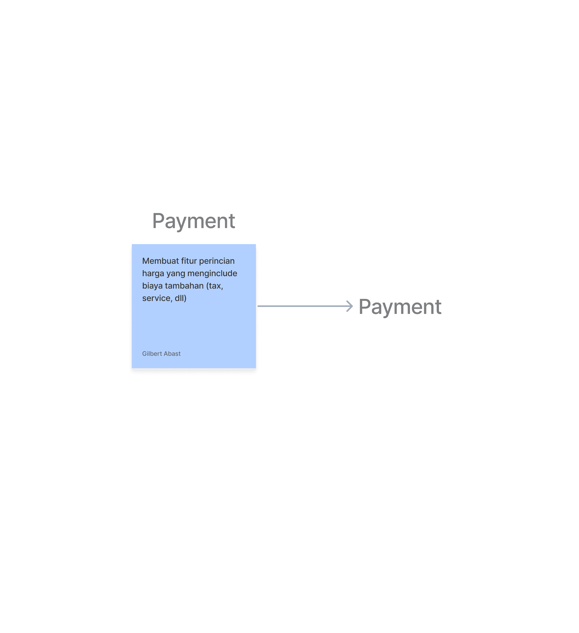
In designing this payment system, we focused on providing clear information. We saw users' frustration when booking office spaces, as they often feared unclear pricing.
We were creating an expanding dropdown to accommodate a large amount of content clearly and efficiently.
We designed the booking process to be very simple, allowing users to quickly reserve office and co-working spaces. After the users confirmed their payment, they would proceed to the payment step. Once the payment was completed, a receipt would appear, confirming the successful transaction.

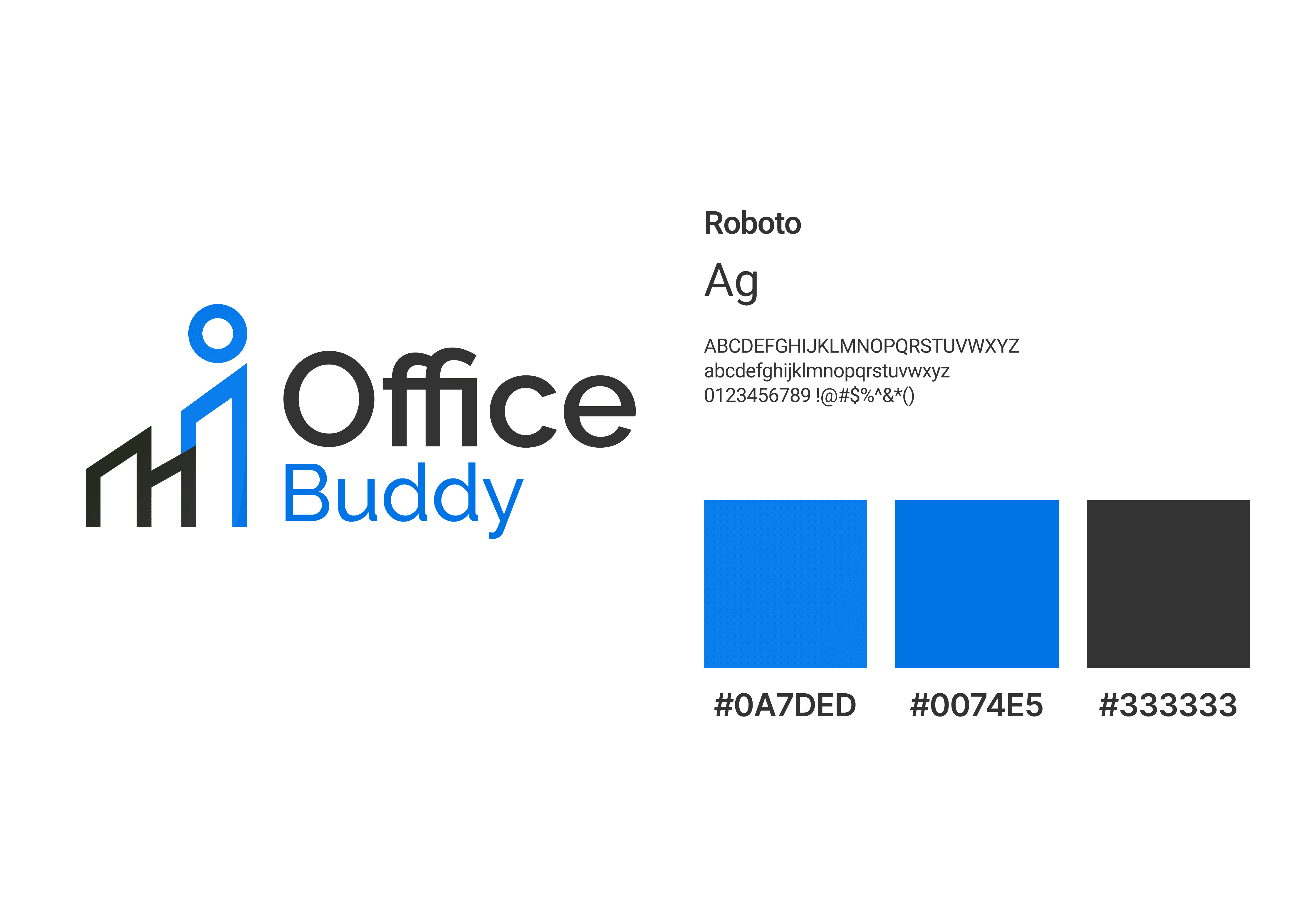
I was designing the Office Buddy logo, drawing inspiration from towering office buildings and the concept of a "buddy" or colleague. Combining these two elements, I created a unique logo.
I chose the color blue, envisioning the perspective of employees inside the building looking up at the sky.
After we had created the wireflow to illustrate the solution we were delivering to the users, we started working on the high-fidelity designs to provide the highest resolution images in our design. Sometimes, we do several changes from our wireflow.
Our focus was on ensuring that the high fidelity designs aligned perfectly with the wireflow we had created. However, while we were working on it, we did incorporate some additions based on team discussions.
Product Details: Provides information in the 'details' office with a dropdown

Product Details: Provides an option in the review feature in the form of uploading photos along with a caption for each photo.

Product Details: Create a Change Schedule button on the co-working space card that has been booked and provide 'details' of office availability status
High fidelity at homepage was based on wireflow: this way, users can immediately order or book the nearest office or co-working space quickly.
Homepage: Creating a feature that recommends the nearest office to the user and integrates with Maps, developing "contact us" options for both the app and office space owners, and implementing a search bar for users to find near locations.
During the process of creating the high-fidelity prototype, we didn't include the Contact Us feature due to the extremely tight timeline. Additionally, the development required significant time and collaboration between the Front-End Mobile Developer and the Back-End Developer. As a result, we decided to cut that feature.
The booking process and payment were combined into a single wirefame flow, where the user's goal was to book an office or co-working space.

After completing the high-fidelity designs, I initiated a design critique session. The purpose was to redefine the high-fidelity designs based on design principles and feedback from the team.
The design critique began with the team reviewing the initial high-fidelity prototype we had created. Following this, we held a session of critique and discussion regarding the high-fidelity design. The outcome of the design critique was the refined high-fidelity prototype shown above.

The result was an improved checkout display and successful transactions. We were removing the navbar and the map, emphasizing the hierarchy, using strokes that weren't too thick, and improving the spacing by optimizing dropdown usage.
These changes made the user experience more seamless and intuitive.
Before creating the design system, my team and I were discussing with the team the reasons for developing a design system. During our discussion, we identified a key term: Consistency.
Following the discussion, I started to develop the design system for Office Buddy, based on the design process we had established so far.
My inspiration from this link.
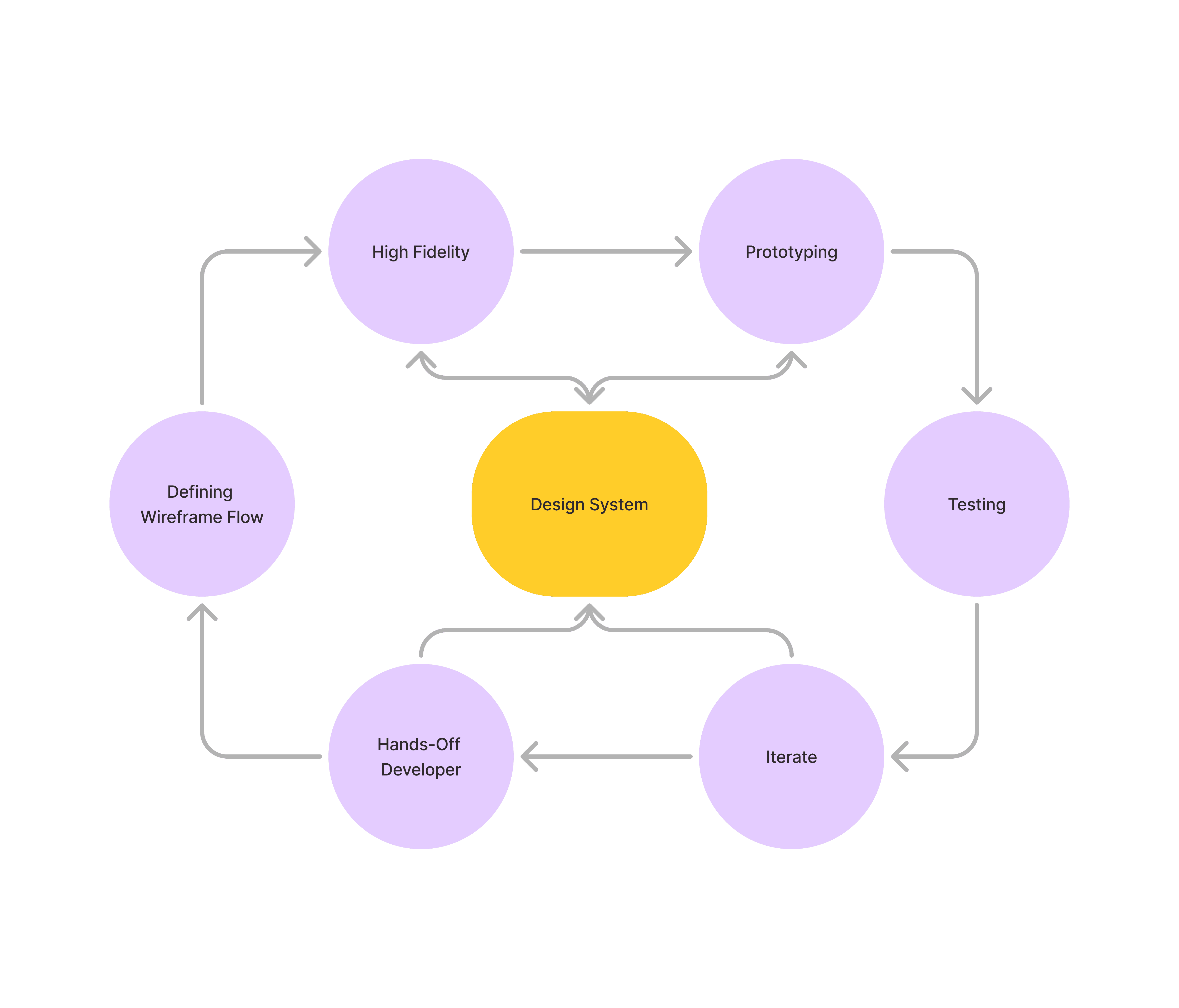
The team had understood the purpose of the design system, I began exploring the workflow and the functioning of the design system components to my team. Here is our flow for push and pull design system office buddy.

The purpose of this flow was to make it easier for the team to determine whether a component needed to be added to our design system, while also preventing documentation overload from the developers.
We were developing our design system, drawing inspiration in part from the Material 3 design kit. Additionally, we created several custom components for both the landing page and the dashboard.

During this prototyping session, we focused on connecting the flow of the high-fidelity designs we created into a cohesive prototype. You can try the prototype below 👇🏻.
To test whether our design effectively addressed user problems, we conducted usability testing. We wanted to determine if the features we offered were user-friendly and functional.
Additionally, the purpose of this usability testing was to iterate and make improvements for the future.
We made preparations by creating a research design and in it creating user scenarios to try our features. We were creating usability tesing for 10 participant.
The user scenario that we were creating consists of 5 user scenarios. Each user scenario has its own user goals and tasks.
Scenario 1: Enter the main view of the Office Buddy application
User goal: Enter the Application
Task: You as a user want to enter the office booking application, start entering the application!
Scenario 2: Book an office
User goal: Book an office via search or suggestion
Task: After entering the application, you want to book an office. Try booking 1 office!
Scenario 3: Make sure the order has been successful
User goal: Make sure the order has been successful.
Task: Try to make sure the office order you made was successful
Scenario 4: Changing the office schedule
User goal: Changing the wrong booking schedule
Task: It turns out you chose the wrong office schedule, try changing the office schedule that you previously booked!
Scenario 5: Give a Review of an Order
User goal: Provide a review regarding an office that has been used
Task: Cool! You have used the office you ordered. Now try to share your experience after using the office!
During this usability testing, we employed a SEQ variable ranging from 1 to 6 on the Likert scale to assess user comfort while interacting with the prototype features.
The results indicated that users successfully completed the tasks we assigned. Our warning threshold for the SEQ was set at 4.5.
Here are the findings from the usability test:
User Scenario 1: 5.9
User Scenario 2: 5.1
User Scenario 3: 6.0
User Scenario 4: 5.5
User Scenario 5: 5.5
These results demonstrate that the prototype features were generally well-received, with all scenarios exceeding our threshold and indicating a positive user experience.

From usability testing that we got feedback in each user scenario:
Scenario 2
The orders tab on the nav bar is separated into 2 tabs, namely Orders and History
Price is added per unit of time
CTA Calendar clarified
The booking button is always visible
Scenario 4
The orders tab on the nav bar is separated into 2 tabs, namely Orders and History
Scenario 5
Added badge (status) to history tab
The main problem is the Orders Tab on the navbar which should be separated into 2 tabs, namely Orders and History because these 2 tabs have different functions.
So if the tabs are combined, it will make it difficult for users to find the reschedule and review features. Apart from that, adding badges can also help in providing information related to the review feature.
Furthermore, adding detailed information such as the time unit for each product sold (office & co-working space) is needed to make it easier for users to understand prices in time units.
The last thing that needs to be improved is the placement and prominent color of the CTA so that users can carry out booking and rescheduling actions more quickly.
After we had completed analyzing the feedback, we refined our design prototype. As a result, the final outcome aligned perfectly with the feedback we had received from the users.

Throughout the entire process our team undertook until completion, our design evolved to perfectly match the solution we created. This solution was designed to address the needs of the users effectively.
Moreover, the design we crafted was meticulously developed by our team of Front-End Mobile Developers and Back-End Developers. You can check the apps here (100% safe)
From this project, we learned many things about product design. Personally, I gained valuable experience in team management.
However, the key takeaways from this experience were:
I learned how to effectively manage a team, focusing on communication and collaboration.
I learned how to communicate and collaborate with other departments.
I learned how to lead a team in defending our designs when interacting with other departments, particularly Front-End (Mobile and Website) and Back-End Developers.
I learned to appreciate the opinions of others and different departments.
Here are some designs I've created while in this project👇🏻
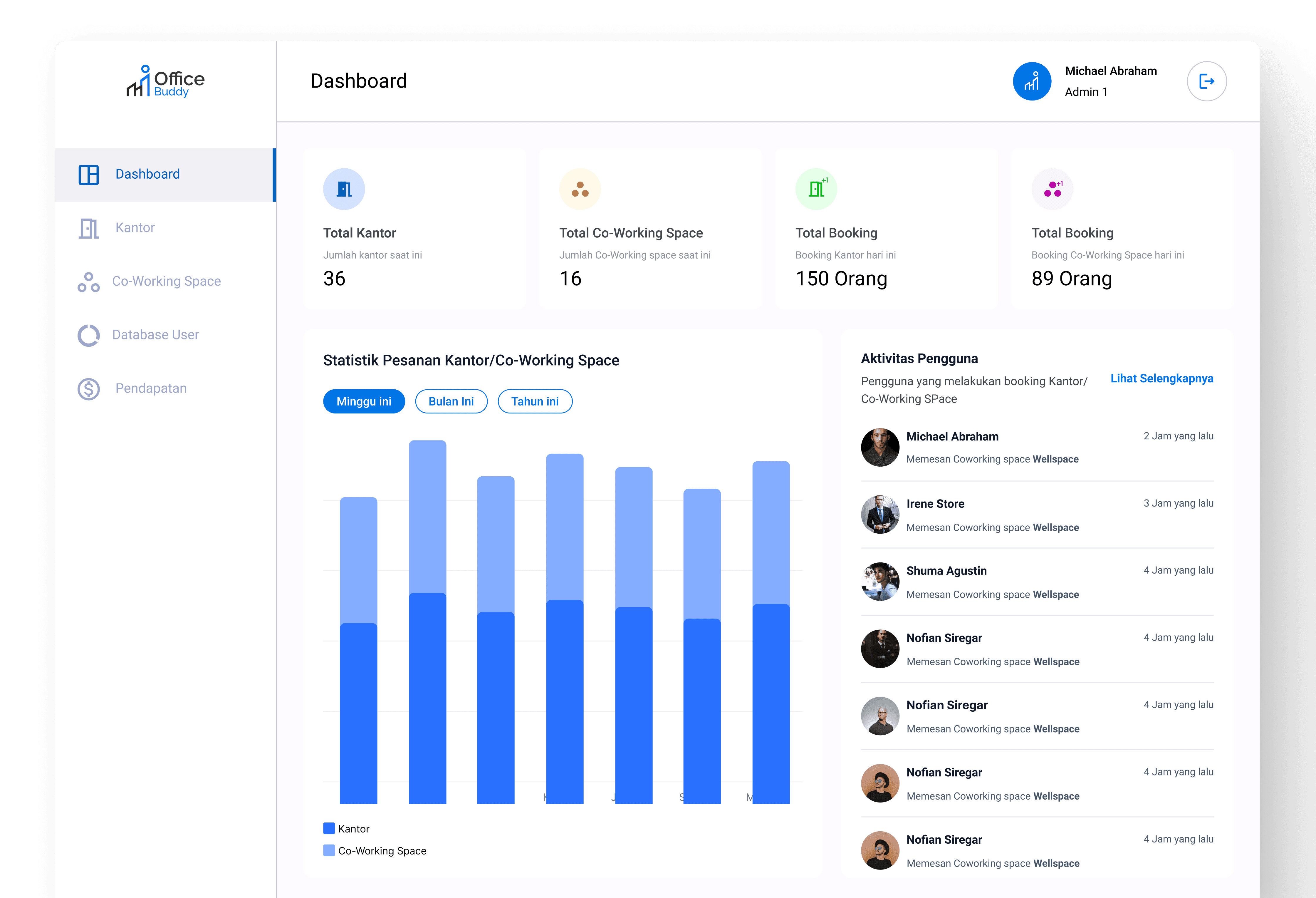
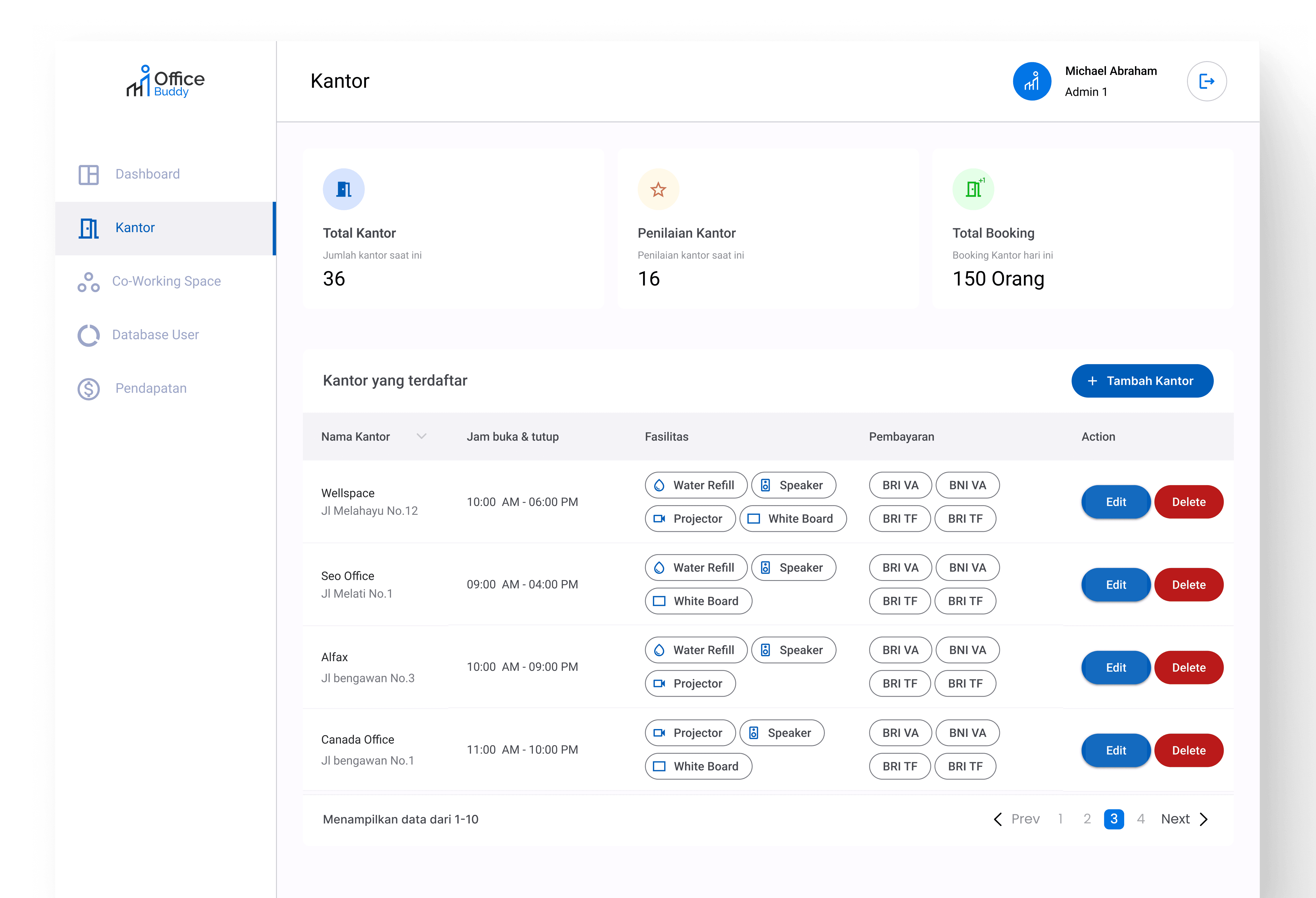
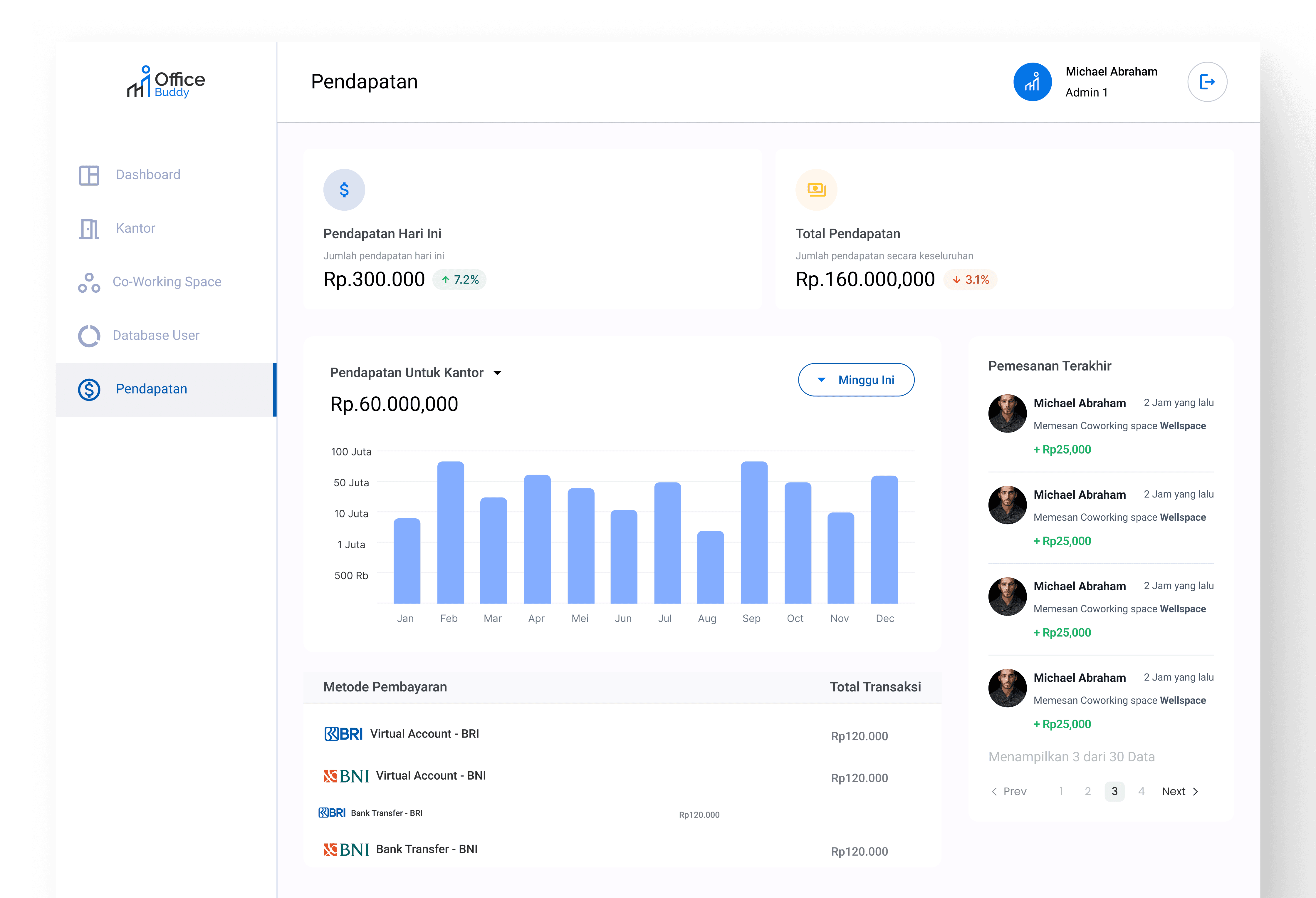
The purpose of this dashboard was to add, organize, and remove offices within the Office Buddy application.
As users interacted with it, they were seamlessly able to manage the office listings, ensuring the app remained up-to-date and well-organized.

© Michael Abraham 2024